Serif and sans serif fonts are two of the most common font styles used in typography today. While they may seem similar at first glance, there are distinct differences between the two that can have a significant impact on the overall look and feel of a design. We have tried our best to help you understand Serif vs Sans Serif Fonts topic in detail.
Understanding these differences and the proper usage of each style is crucial for any designer or marketer looking to create effective and visually appealing content.
Let’s define both of them first before looking at the major differences between these two types of font styles.
What is Serif?
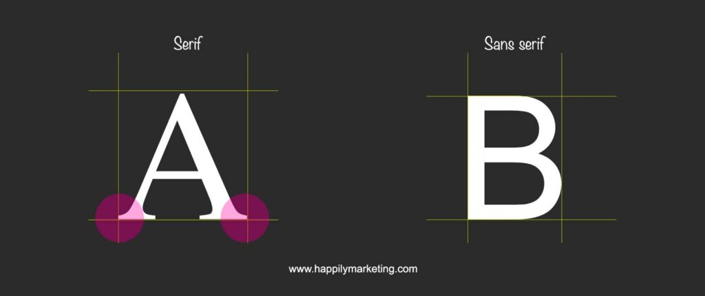
Serif fonts are typographic styles that feature small lines or strokes attached to the ends of the main strokes of a letter or symbol. These lines are called serifs, and they are believed to have originated from the first official Greek writings on stone and in Latin alphabet with inscriptional lettering.
The stone carvers followed the brush marks, which flared at stroke ends and corners, creating serifs. Another theory suggests that serifs were devised to neaten the ends of lines as they were chiselled into stone.
The term “serif” is obscure, but it is almost as recent as the type style itself.
Here is the example

Serif Vs Sans Serif : Major Differences
Defining serif and sans serif fonts is the first step in understanding their differences. Serif fonts have small lines or flourishes at the ends of each letter, while sans serif fonts do not.
These small lines, or serifs, give serif fonts a more traditional and classic look, while sans serif fonts are often seen as more modern and minimalist.

While both styles have their own unique characteristics, neither is inherently better than the other, and the choice between the two ultimately depends on the specific needs and goals of the design.
Key Takeaways
- Serif fonts have small lines or flourishes at the ends of each letter, while sans serif fonts do not.
- Serif fonts are often used in print media, while sans serif fonts are often used in digital media.
- The choice between serif and sans serif fonts should be based on the specific needs and goals of the design and the preferences of the target audience.
A quick look at the popular logos in Serif and Sans Serif Font styles

Defining Serif and Sans Serif Fonts
Serif and sans serif fonts are two of the most commonly used font families in graphic design and typography. The main difference between the two is the presence or absence of small lines, or “serifs,” at the end of each character stroke. Serif fonts have these small lines, while sans serif fonts do not.
Historical Evolution and Characteristics
Serif fonts have been around for centuries and were originally created during the Roman Empire. The first serif fonts were carved into stone and were used for inscriptions. Over time, serif fonts evolved and became more ornate, with different styles emerging during different time periods.

Sans serif fonts, on the other hand, emerged much later, in the 19th century. They were originally created for display purposes, such as headlines and advertisements, and were designed to be more legible from a distance.
Serif Fonts: Tradition and Legibility
Serif fonts are often associated with tradition and formality. They are commonly used in printed materials such as books, newspapers, and formal invitations. Serif fonts are also known for their legibility, as the serifs help guide the eye from one character to the next.
There are several different styles of serif fonts, including old-style, transitional, and modern. Each style has its own unique characteristics and is often associated with a specific time period.
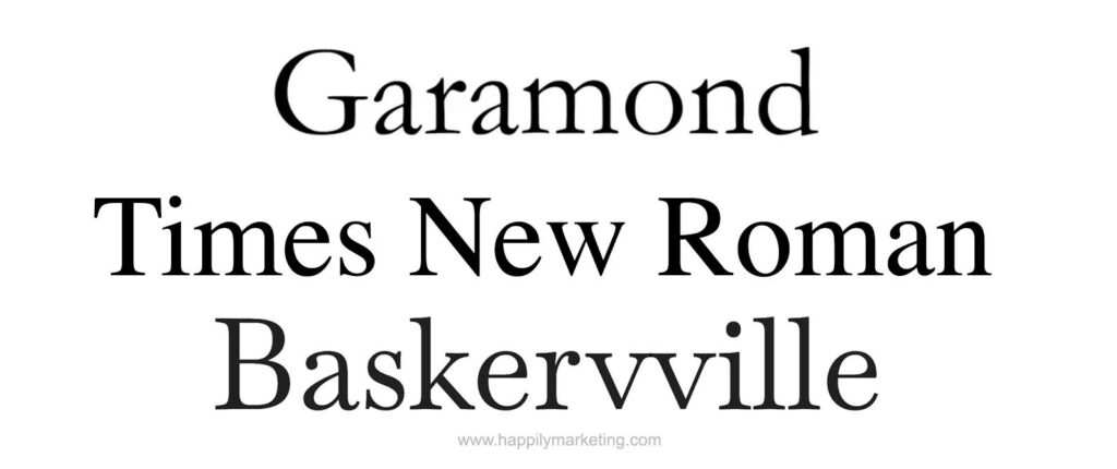
Some of the most popular serif fonts include Garamond, Times New Roman, and Baskerville.

Sans Serif Fonts: Modernity and Simplicity
Sans serif fonts are often associated with modernity and simplicity. They are commonly used in digital media, such as websites and mobile apps, as well as in advertising and marketing materials. Sans serif fonts are known for their clean, modern look and are often used to convey a sense of simplicity and clarity.
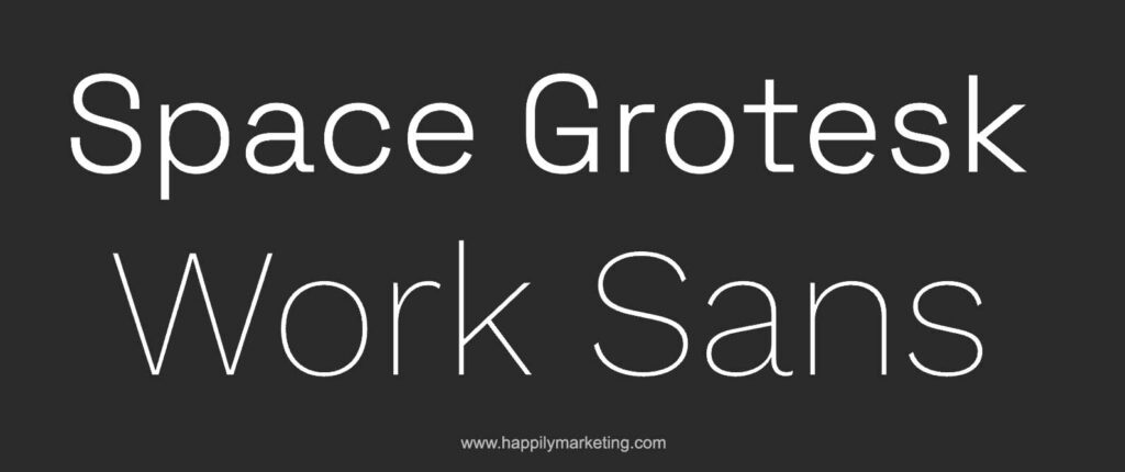
There are several different styles of sans serif fonts, including neo-grotesque, geometric, humanist, and grotesque. Each style has its own unique characteristics and is often associated with a specific design aesthetic.

Some of the most popular sans serif fonts include Helvetica, Arial, and Futura.
Serif and sans serif fonts each have their own unique characteristics and are often associated with different design aesthetics.
Understanding the differences between these two font families can help designers choose the right font for their project, whether it be a traditional printed piece or a modern digital design.
Practical Applications and Usage
When it comes to choosing between serif and sans-serif fonts, there are several practical applications and usage considerations to keep in mind. This section will explore some of the most important ones.
Choosing the Right Font for Branding
One of the most important considerations when choosing between serif and sans-serif fonts is branding. The font you choose can have a significant impact on your brand’s identity, tone, and personality.
For example, a clean and approachable sans-serif font may be a good choice for a startup or tech company, while a more traditional serif font may be a better fit for a luxury brand.
When designing a logo or creating brand identity materials, it’s important to choose a font that reflects the message you want to convey.
Serif fonts like Baskerville, Georgia, Bodoni, and Caslon are often associated with traditional or classic design, while sans-serif fonts like Verdana and Roboto are often used in more modern or minimalist designs.
Impact on Readability and User Experience
Another important consideration when choosing between serif and sans-serif fonts is readability and user experience. Serif fonts are often used for body text in books, newspapers, and magazines because they are believed to be more readable in print.

On the other hand, sans-serif fonts are often used for headlines and content on digital platforms because they are believed to be more readable on screens.
However, it’s important to note that there is no hard and fast rule when it comes to font choice and readability.
Some studies have shown that sans-serif fonts can be just as readable in print as serif fonts, and vice versa. Ultimately, the most important factor in readability is the design and layout of the text itself.
Font Pairing and Design Considerations
Finally, when choosing between serif and sans-serif fonts, it’s important to consider font pairing and overall design.

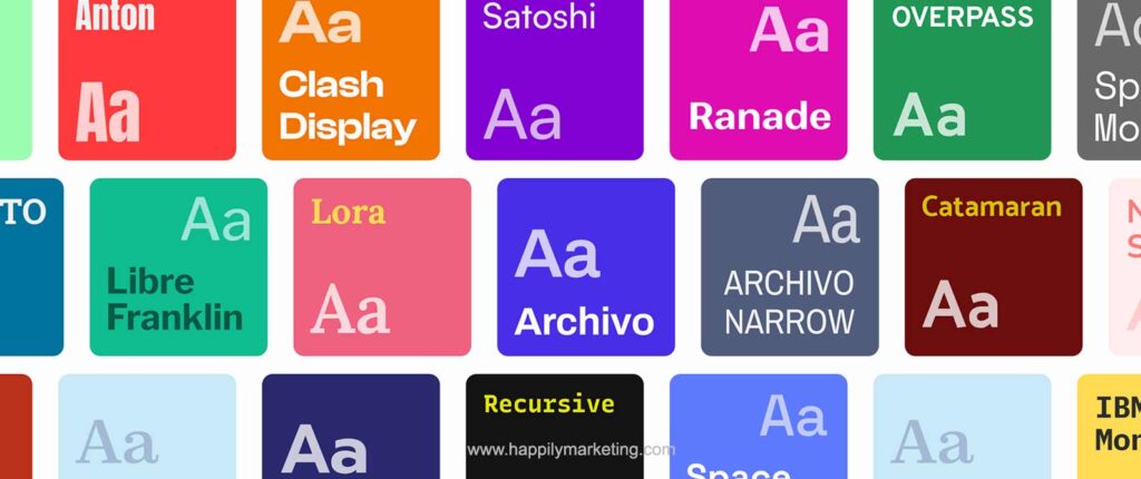
Pairing two different fonts can create visual interest and help convey a message or tone. For example, pairing a serif font with a sans-serif font can create a contrast between traditional and modern design.
When designing presentations, signage, or social media graphics, it’s important to choose fonts that work well together and complement the overall design.
The New York Times and Google are two examples of companies that have successfully used serif and sans-serif fonts together to create a cohesive and visually appealing design.

In summary, when choosing between serif and sans-serif fonts, it’s important to consider factors like branding, readability, and overall design. While there are no hard and fast rules when it comes to font choice, by keeping these considerations in mind, designers can create effective and visually appealing designs that convey the desired message and tone.


