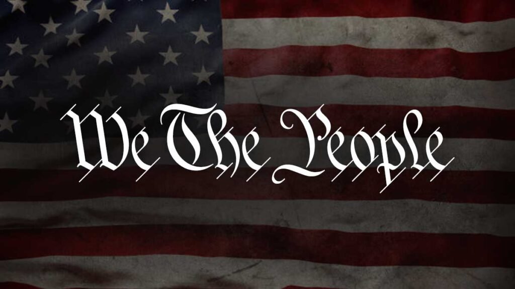
Ever seen the US constitution preamble and wondered what font it is written in? The Us constitution preamble is handwritten based on German text and square calligraphic style exemplars from George Bickham’s penmanship copy-books.
In 1787, the primary constitution document was transcribed over the weekend onto parchment by Jacob Shallus, a Pennsylvania Assistant Clerk.
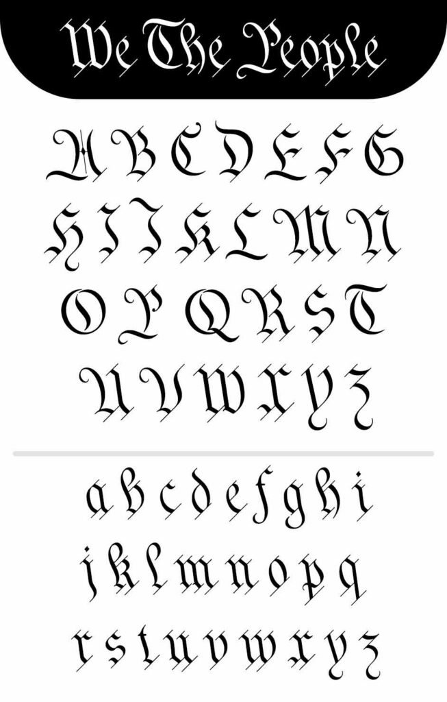
We the people font is an extrapolated version of “we the people” calligraphy, which Jacob Shallus originally handwrote in 1787. A backward slant of the titles seems quite unconventional, suggesting a secondhand and perhaps beginner, which is claimed 14-year-old trainee Francis may have inserted.

At the end of the document, there is an inconsistency in the structure of the letter n, used for “fact” and “In Testimony.” Even though you can’t resist admiring the graceful arrogance of wavy t, h, and l, this K-type font extends to letters b,f and k.
The simpler Schwabacher-style W, an enlarged version of the lowercase w, is less fancy in German text and square in Bickham manuals than in the uppercase W.
DOWNLOAD HERE
About the “We the people” font
Are you one of those designers using OpenType-Complimant applications or searching for one? In that case, we the people font is available with alternatives including a Bickham style w, the letters t, h, and n with added flourishes, two simpler forms of A, and Roman numerals for numbering items.

It also includes a few ornamental flourishes to add around the midpoint/decimal point. The punctuation marks are drawn in square and alternate round point/ full point calligraphic style to use with currency and numbers.
The above feature can be accessed using Shift Option 9 on Mac or Alt 0183 on windows in a period-centered position ( placed on the baseline). The phrase “we the people” is placed at the trademark keystroke and can be made available through Shift Option 2 on Mac or alt 0153 on windows.
If you find the back slant unpleasant, the licensed typeface includes two extra fonts with a vertical look. This font may use to make it more conducive to graphic design layouts.
These fonts include ” we the people Upright” and “we the people Upright bold,” which retain the distinctive style and heavier weight & are only slightly emboldened, just enough to add some uppercut.

The original constitution document with “we the people” font, with backward sloping, is free for personal use. The term free for personal use includes free use by students and teachers in schools, colleges and universities, and educational institutions. It also can be accessed by public charities, museums, and libraries.
It is inspired by various styles, mainly Gothic and K-Type designs. It is a free font that can be accessed free for personal use. The file would seem to support OTF and TTF file formats.

“We the people” Font Family.
One has to admire the vintage yet modern look of the we the people font. The font has a slight touch of classic and historical design. Due to this, “we the people”, has been placed in a trendy font among designers, and you may find it in most royal designs.
The font comes with a whole set of uppercase, and lowercase, characters with fancy glyphs. Also, this typeface supports multiple languages, punctuation marks, numbers, etc.
The font family includes three typefaces
1) “We the people regular”
2) “We the people upright regular”
3) “We the people upright bold”
Usage of ” we the people” font
As we the people font, employed a style based on vintage and Gothic, it is a great choice for different purposes. Designers use it to design logos, headlines, editorial designs, digital marketing, website designs, etc.
Using this font for the above purpose and designs would not disappoint you. Also, you can use it in posters, political campaigns, or even fundraising events. This font works well in above mentioned uses.
Alternatives of we the people font
If you want the vintage and gothic look of we the people font but don’t want to use it, great options can work well with your designs. They have similar styles but different typefaces to add to your vintage font collection.
These fonts have back slanted typeface, which suggests that the calligraphic title design is more suitable for text and design work.
- Trade Gothic Font
- Diploma Font
- Dollar Bill Font


