If you want to add a touch of vintage charm to your design projects, look no further than retro color palettes. These colors capture the essence of past decades, from the bold and vibrant hues of the 1950s to the muted and subdued tones of the 1970s. By incorporating retro colors into your designs, you can create a sense of nostalgia and an old-school aesthetic that will stand out.
But where do you start with retro color palettes? Choosing from the wide range of colors available and knowing how to combine them effectively can be overwhelming. That’s where Retro Color Palettes 101 comes in.
In this post, we’ve gathered some of our favorite vintage color palettes, complete with HEX codes and tips on how to use them in your logos and graphics. Keep reading to find the perfect vintage color scheme for your next project!
What is a vintage color scheme?
Vintage color schemes, also known as retro color palettes, are color combinations that evoke the look and feel of the past. These nostalgic color schemes are perfect for creating a vintage-inspired design or adding a touch of retro flair to any project.
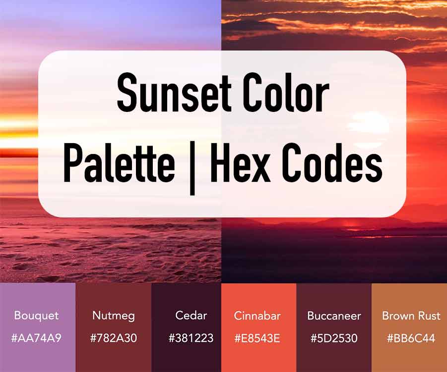
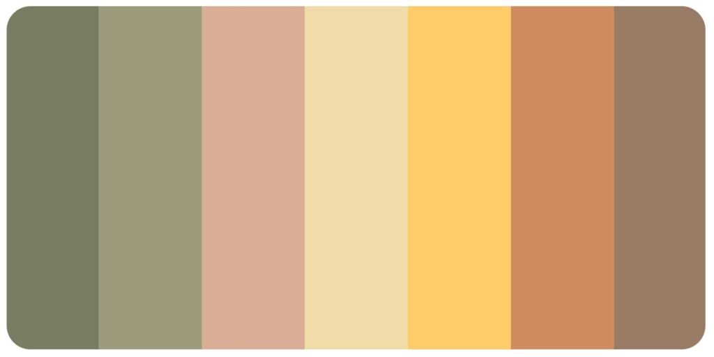
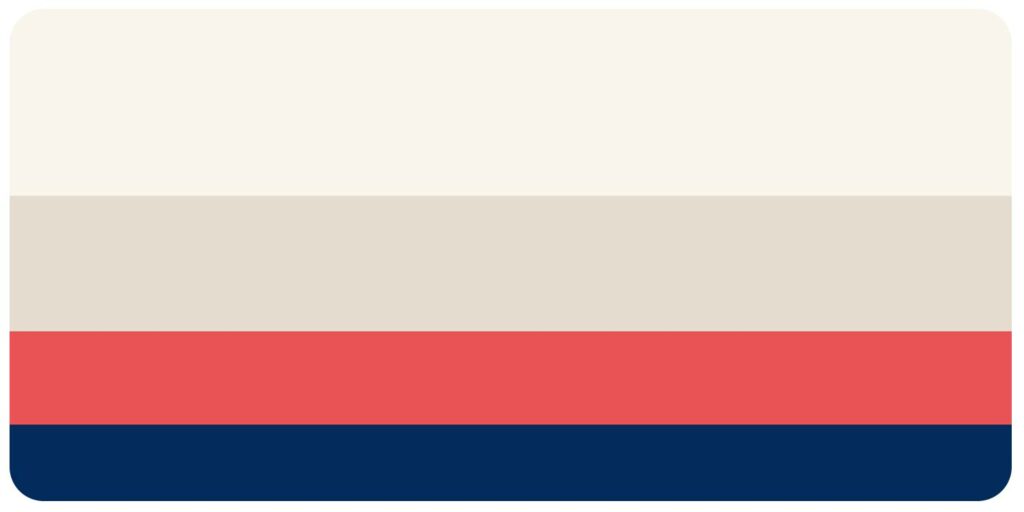
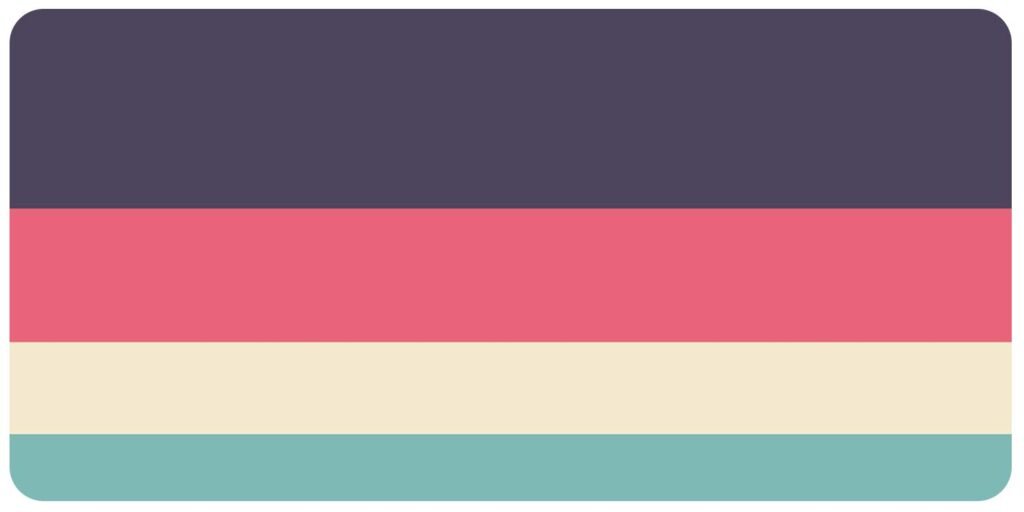
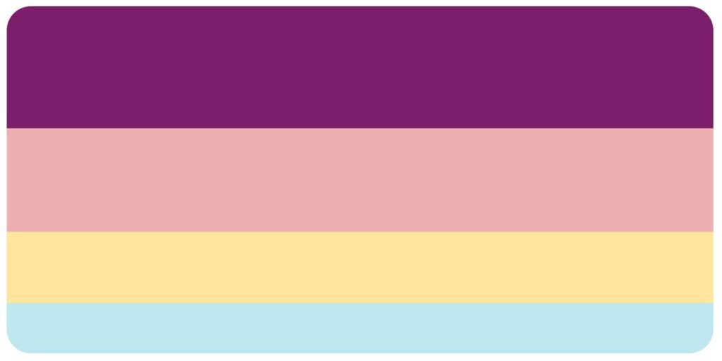
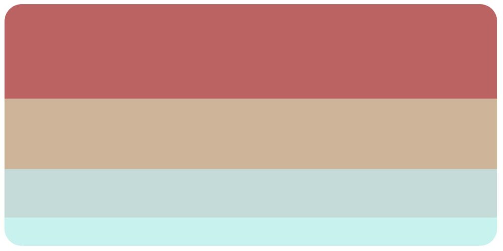
Here are some vintage color palettes to consider using
These vintage color palettes can be used in various design projects such as graphic design, web design, fashion, interior decoration, and more. When using these color schemes, it is important to keep in mind the mood and tone that the colors evoke and use them to enhance the overall aesthetic of the design.
Pro tip: Compliment a vintage color palette with a corresponding vintage-inspired font for an added effect.





What colors are retro colors?
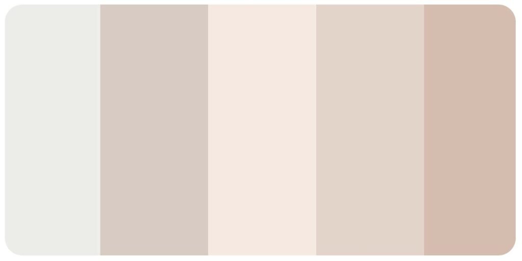
Curious about what colors fall under the retro color category? Well, retro colors are known for their muted tones that don’t necessarily draw from primary colors. Instead, retro colors can range from soft neutrals like creams and yellowed browns to bold hues like blues, sage green, teal, and pastels like peach and pale pink that evoke an art deco style. These colors take inspiration from various decades, from the 1920s to the 1970s, and can add a vintage flair to any design project.
You can create a 70’s inspired, fun, and visually appealing look by incorporating bright and colorful elements. So, if you plan to create a retro-inspired design, use bright and bold colors to help you achieve the desired look.




Green Retro Style Color Palettes For You
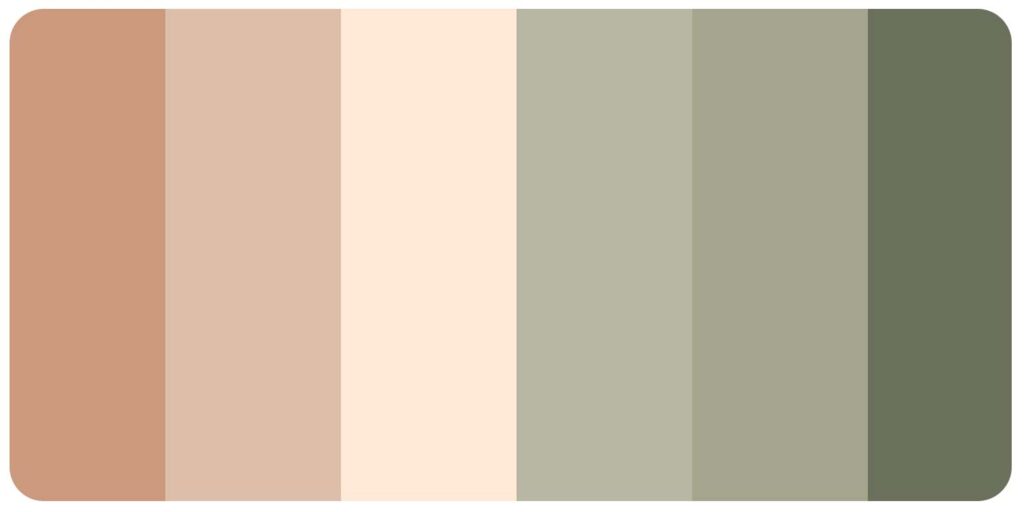
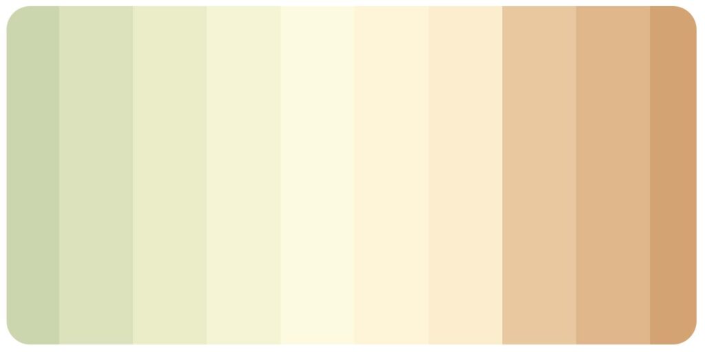
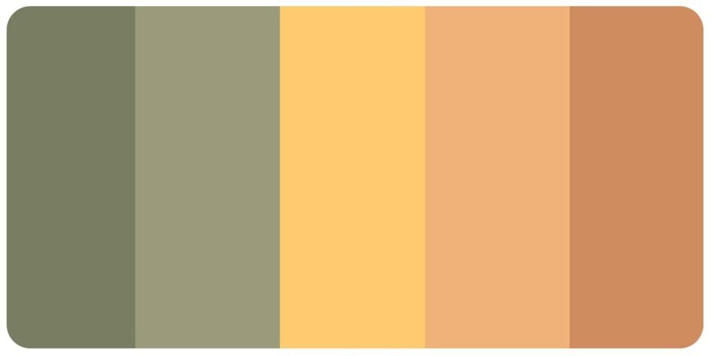
Retro color palettes are an excellent way to give design projects a nostalgic feel and green tones play a significant role in this aesthetic. Drawing inspiration from the past, trendy retro color palettes are a great way to add charm and appeal to your visuals. Here are some retro-style color palettes with green tones for design or drawing projects:
Use these retro-style color palettes to enhance your designs by incorporating them into your backgrounds, fonts, and graphics. Remember to create a link between different visual elements on your website or artwork.
Pro tip: Experiment and have fun with different retro color palettes to find the perfect fit for your specific project!
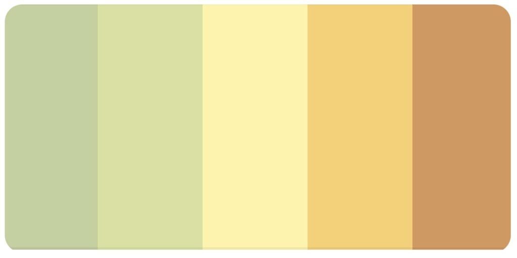
Retro Pastel Color Palette

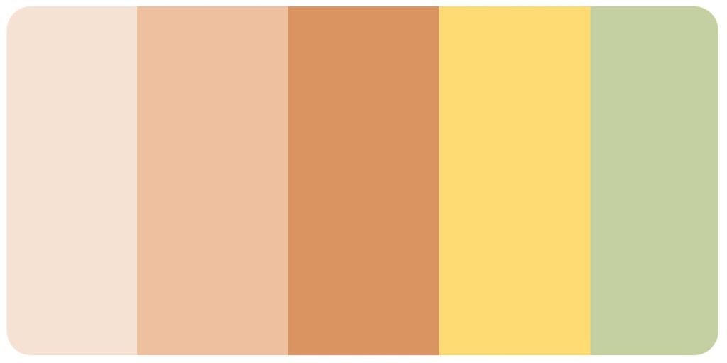

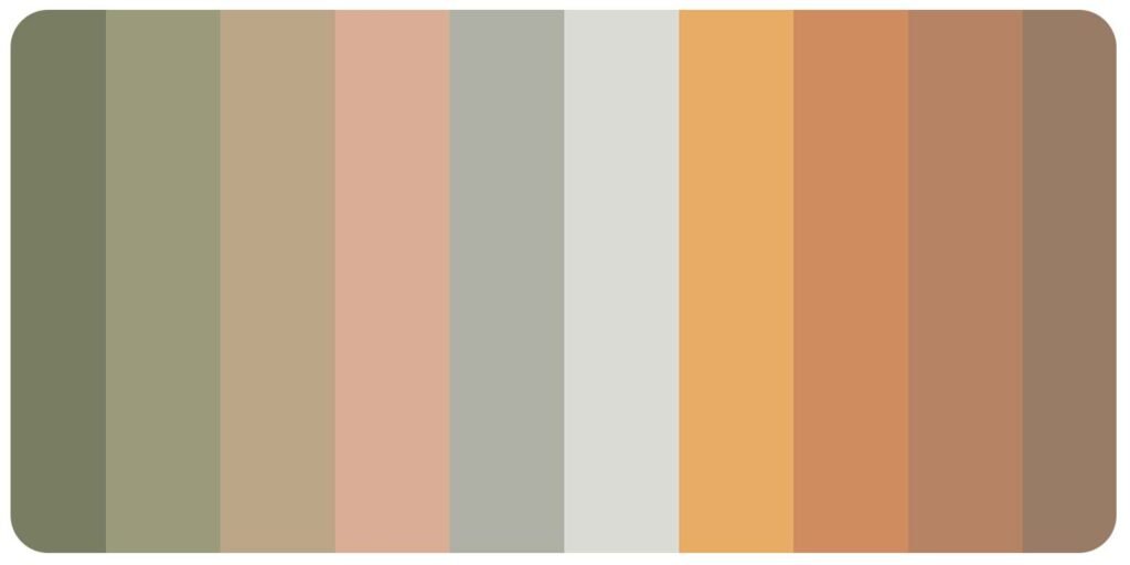
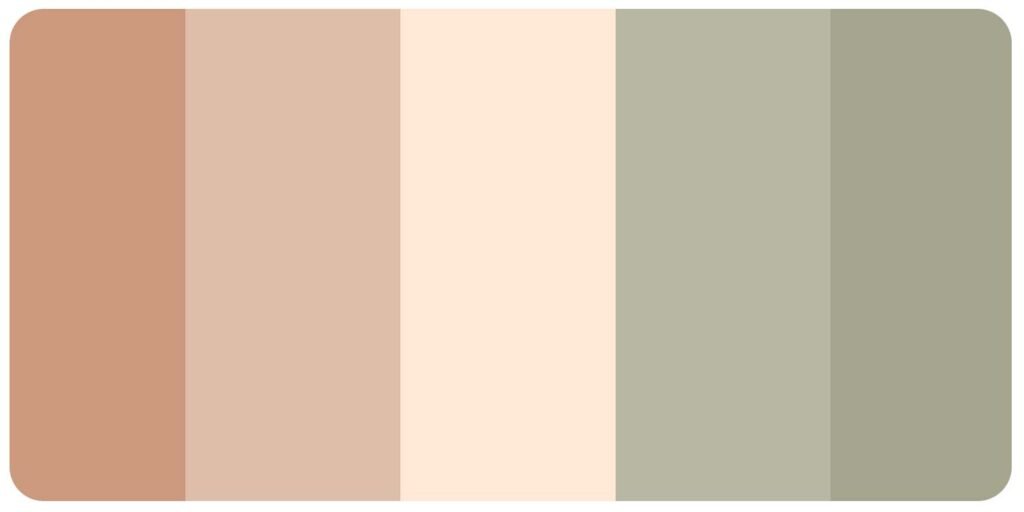

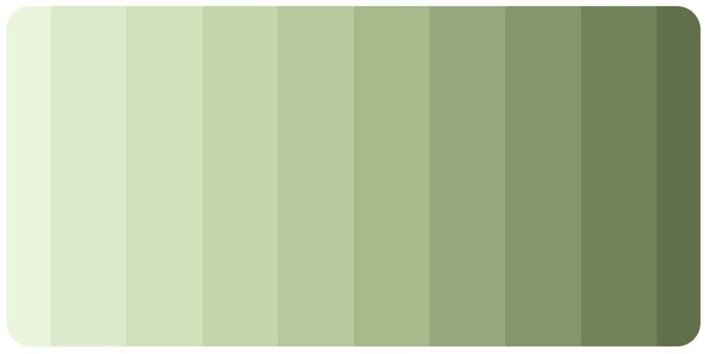
This retro pastel color palette is inspired by the colors popular in the 1950s and 1960s, known for their soft, muted hues reminiscent of milkshakes and vintage automobiles.
This color palette creates a nostalgic and whimsical look in your artwork or designs.
Some of the colors that feature in the retro pastel color palette are:
Warm Retro Color Palette
A warm retro color palette is a vibrant selection of colors inspired by the nostalgia of the 60s and 70s. This color palette includes a blend of bold and muted colors perfect for creating a vintage-inspired look in your designs.
These colors can be used in various design projects, including branding, packaging, web design, and more.


Bright Retro Color Palettes
The Bright Retro color palette features bold and vibrant hues that add a fun and whimsical touch to any design project.
Pro Tip: When using a bright retro color palette, use it sparingly and balance it with neutral colors to avoid overwhelming the design.

Conclusion
In conclusion, retro color palettes offer a fun and unique way to add personality to your design projects. Whether you’re looking to create a vintage-inspired logo or add a touch of nostalgia to your social media graphics, the possibilities are endless with retro colors. We hope this article has provided excellent color inspiration and helped you choose the perfect palette for your next project.
And remember, you can download these images with hex codes for each color palette we featured in this post, making it easier than ever to incorporate retro colors into your designs. So go ahead and experiment with these fun and funky hues, and watch your designs come to life with a touch of retro flair!


