Ever wondered How to Make Text Stand Out in your designs? Join me as we explore the simple yet effective ways to achieve just that.
In this blog post, I’ll be sharing insights and techniques, perfect for both newbies navigating the graphic design world and content creators looking to enhance their visual storytelling.
Let’s dive into the art of making text stand out and bring your creations to life!
Effective Methods for Text Enhancement
Leverage Dark Overlays
- Create a dark overlay and place over the background photo.
- Tweak the overlay’s opacity for balance.
- Set the text to a contrasting color, typically white, and duplicate it for added emphasis.
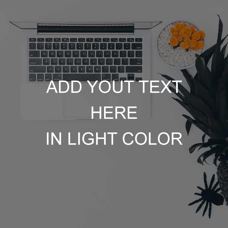
The utilization of a dark overlay improves contrast without overwhelming the background details.
Implement White Shape Overlays
- Craft a white graphical shape.
- Modify the shape’s opacity to enable background visibility.
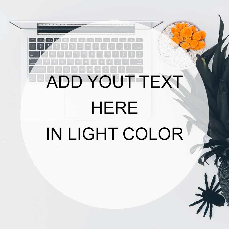
White shape overlays centralize attention on the text while preserving the background’s color vibrancy.
Employ Solid Color Shapes
- Generate shapes in white or any solid color.
- Position these shapes behind the text.
- Introduce a layer of solid color behind the photo and adjust the image opacity accordingly.
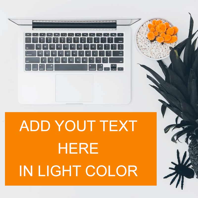
Solid colored shapes paired with opacity changes help the text stand out, ensuring it remains the focal point.
Expand the Background Space
- Enlarge the background image.
- Carve out clear space to introduce text.
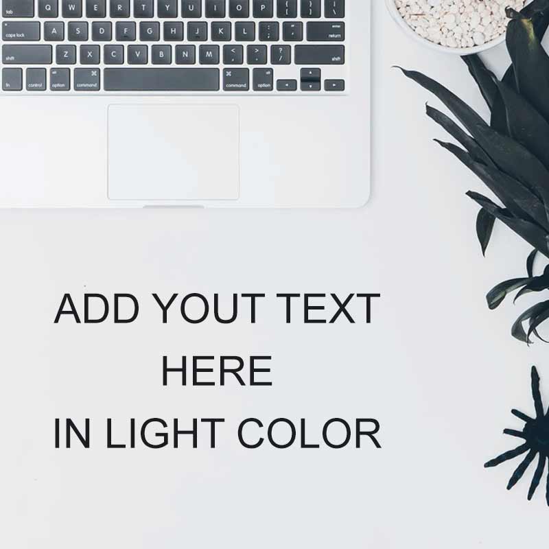
Expanding the image clears areas around the text, guiding the viewer’s attention and enhancing message delivery.
Choosing the Right Tools for Text Enhancement
Now that we’ve explored effective methods for making your text stand out, let’s dive into the tools that can bring these ideas to life. Here are some popular options along with their pros and cons:
Photoshop

- Pros: Robust features, advanced editing capabilities, precise control over design elements.
- Cons: Steeper learning curve for beginners, requires a subscription.
Illustrator

- Pros: Ideal for vector graphics, excellent for logo and typography design.
- Cons: Similar learning curve to Photoshop, may be overwhelming for beginners.
Canva

- Pros: User-friendly interface, pre-designed templates, accessible for beginners.
- Cons: Limited advanced features compared to professional design software.
Crello

- Pros: User-friendly with a variety of templates, suitable for social media graphics.
- Cons: Limited in terms of advanced design functionalities.
Snappa

- Pros: Simple and intuitive, quick to create graphics, suitable for beginners.
- Cons: Fewer advanced features compared to professional design tools.
Final Words
Each tool offers a unique set of features, catering to different skill levels and design needs. Consider your comfort level, the complexity of your project, and the learning curve when selecting the tool that suits you best.
Whether you prefer the versatility of Photoshop, the accessibility of Canva, or the simplicity of Snappa, these tools can help you implement the text enhancement techniques discussed in this blog post.
Read More
16 Elegant Google Fonts: Best Combinations for Timeless Design
Serif vs Sans Serif Fonts: Understanding the Differences and Best Practices
10 Popular Serif Fonts for Your Next Project: Free of Cost
12+ Best Groovy Fonts On Canva (2024)
15+ Canva Fonts That Go Together (2024)

