Typography plays a crucial role in the design and readability of digital content, with font pairings being a fundamental aspect. These Elegant Google fonts can elevate a project by adding a touch of sophistication and distinction.
As Google Fonts offers a wide repertoire of typefaces, it becomes essential for designers to understand how to effectively pair them to harness their full potential. By selecting the right font duo, one can ensure that a design is not only aesthetically pleasing but also functionally coherent.
Key Takeaways
- Effective Google font pairings enhance both aesthetics and readability.
- Professional font selection balances contrast with harmony.
- The top Google font combinations are versatile for various design needs.
Top 10 Elegant Google Fonts 2024
When crafting a visually compelling website, the right font combinations can elevate the design. The following pairings seamlessly blend style and legibility to enhance any digital project.
Serif and Sans-Serif Combos
Understanding the distinction between serif and sans-serif fonts is crucial for effective design. The choice between these two types significantly impacts the visual appeal and readability of your content.
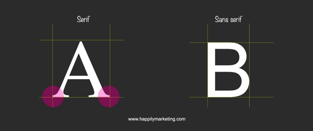
If you’re unsure about the difference, I recommend reading this content – Understanding the Differences and Best Practices of Serif and Sans Serif
Here are some of my recommendation Serif and Sans-Serif font combos.
Playfair Display and Source Sans Pro
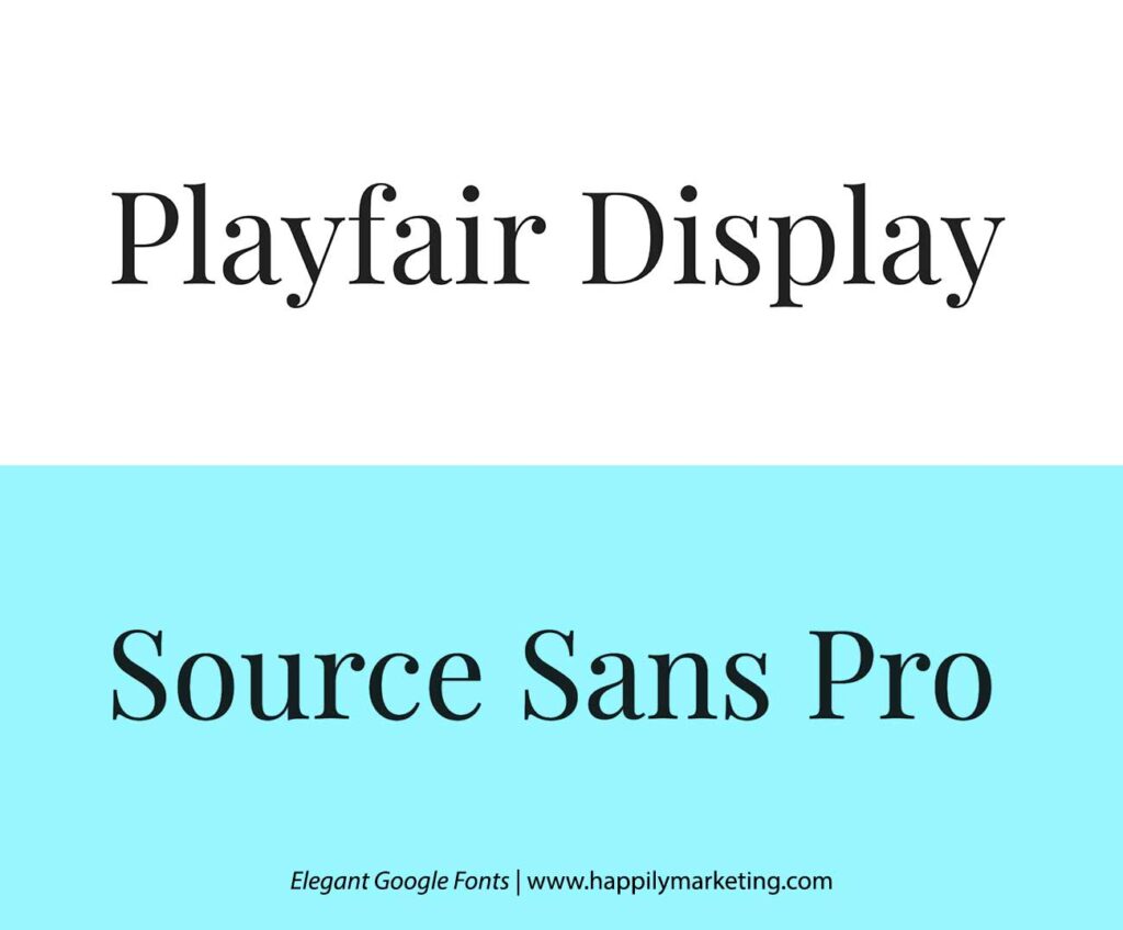
Every thought, what font goes with the playfair display? The refined elegance of Playfair Display meets the clean simplicity of Source Sans Pro, establishing a striking balance perfect for luxury branding.
Roboto Slab and Roboto
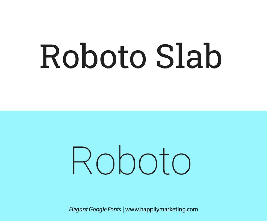
Leveraging the harmonious connection within the same font family, Roboto Slab and Roboto form a duo that is both familiar and distinct, offering versatility across various applications. You can now have a clear idea between Roboto slab vs Roboto font.
Merriweather and Montserrat
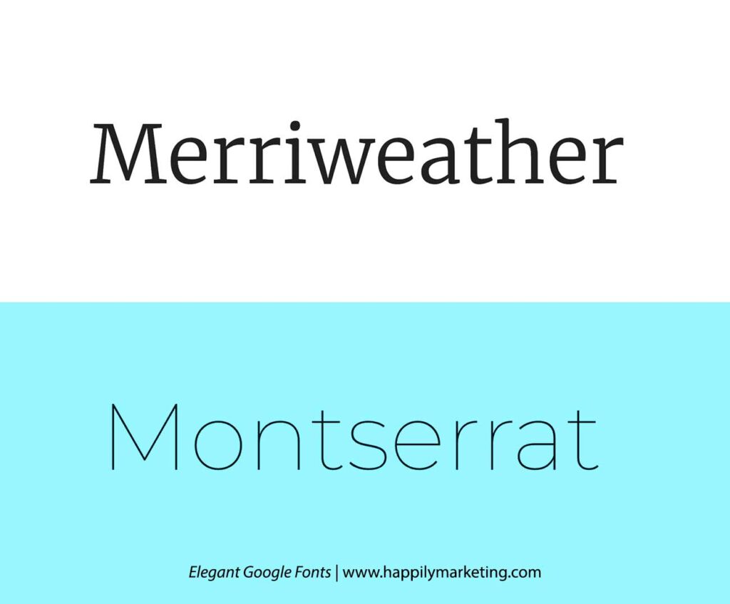
The classic serifs of Merriweather bring a touch of tradition, pairing seamlessly with the modern appeal of Montserrat. This combination is well-suited for a timeless and sophisticated look across diverse design projects.
Crimson Text and Raleway
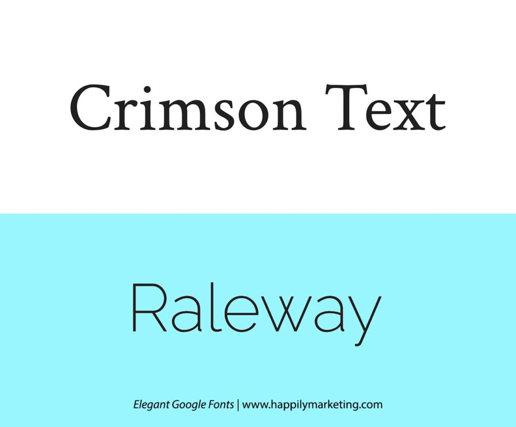
Not sure about the Crimson text font pairing? well, crimson text’s elegant serifs harmonize with the clean lines of Raleway, creating a balanced duo. This versatile combination is suitable for projects ranging from editorial content to contemporary branding.
Noto Sans Georgian and Arimo
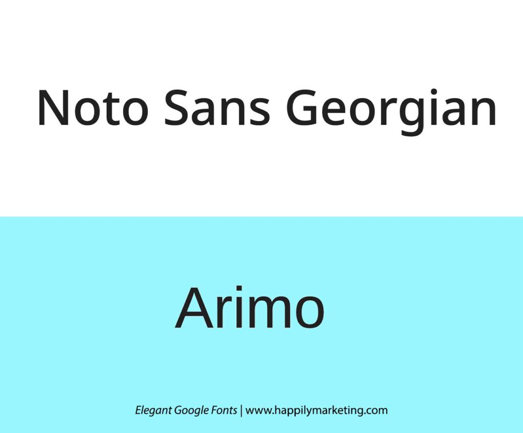
Noto Sans Georgian’s traditional serifs add a formal touch that complements Arimo’s modern simplicity. This combination achieves a balanced and readable design, making it ideal for various professional applications.
Bodoni Moda and Open Sans
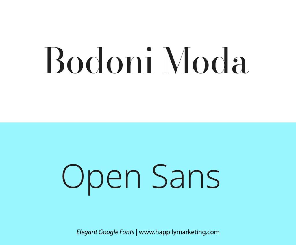
Bodoni’s high contrast serifs pair elegantly with Open Sans’s contemporary sans-serif style. This combination strikes a sophisticated balance, making it suitable for projects that require a blend of tradition and modernity.
Display and Body Copy Harmonizations
Now let’s explore captivating font combinations like Oswald and Open sans, where tall profiles meet warm serifs for striking headlines and comfortable body text.
Oswald and Merriweather
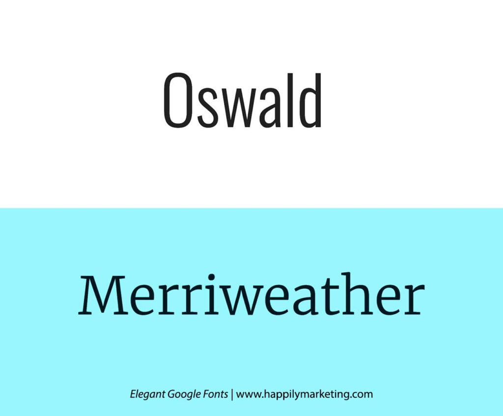
Oswald’s tall and slender profile contrasts beautifully with the robust and warm appearance of Merriweather, making headlines stand out against comfortable body text.
Lora and Ubuntu
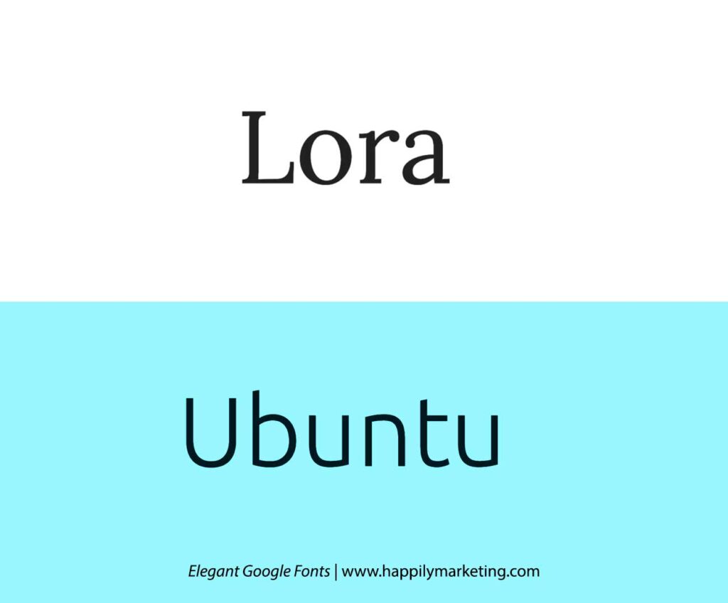
The soft, flowing serifs of Lora meet the neutral and friendly forms of Ubuntu, providing a perfect blend for editorial content.
Bebas Neue and Noto Serif
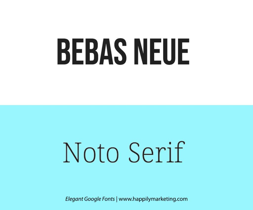
Bebas Neue’s bold and modern look pairs seamlessly with the classic and readable Noto Serif, creating a dynamic combination for attention-grabbing headlines and easy-to-read body text.
Abril Fatface and PT Serif
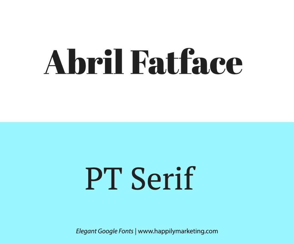
The high-contrast elegance of Abril Fatface complements the timeless PT Serif, establishing a sophisticated pairing that adds flair to headlines while maintaining readability in editorial content.
Libre Baskerville and Montserrat
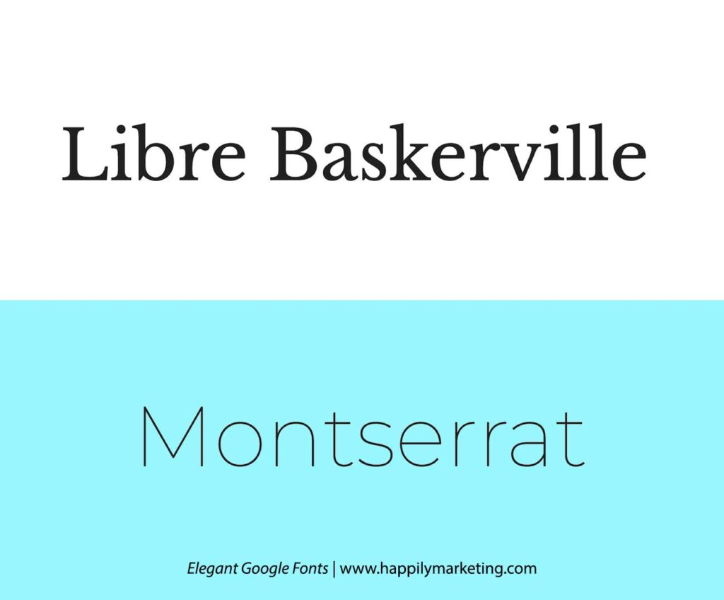
Libre Baskerville’s traditional serifs harmonize with the sleek and modern Montserrat, achieving a balanced blend. This combination is well-suited for projects requiring a mix of classic and contemporary elements.
Cursive and Minimalist Match-ups
Crafting a seamless fusion of cursive charm and minimalist elegance, these elegant Google Fonts continue to redefine your creative projects.
Pacifico and Lato
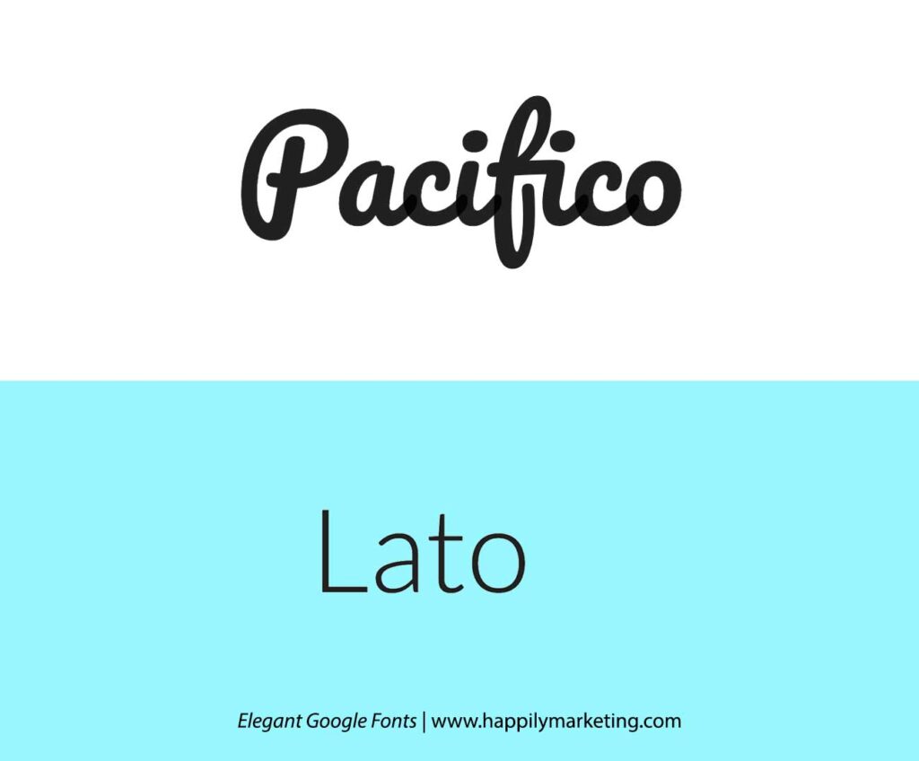
Pacifico offers a laid-back cursive aesthetic that complements Lato’s straightforward and modern character, great for invitations and personal blogs.
Dancing Script and Josefin Sans
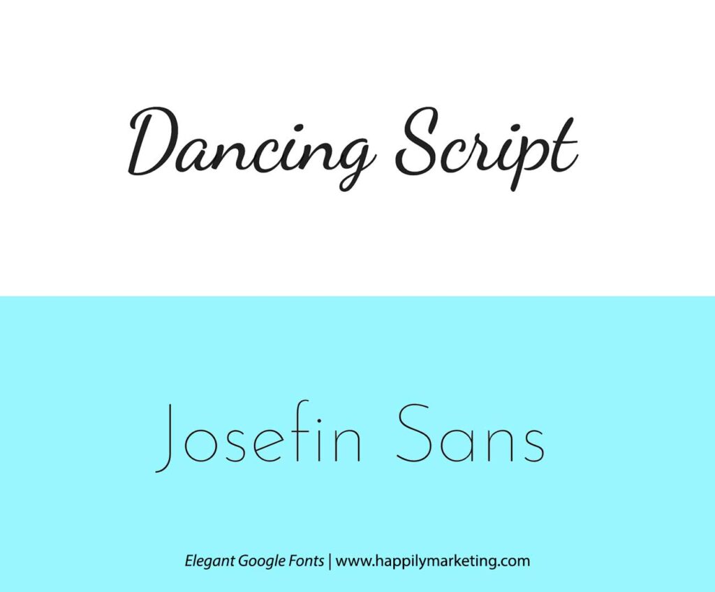
Dancing Script’s casual elegance pairs well with the geometric simplicity of Josefin Sans, ideal for creative projects wanting a touch of flair.
Great Vibes and Roboto
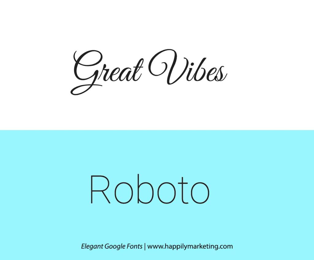
Great Vibes, with its flowing cursive charm, effortlessly meshes with the clean modernity of Roboto. This pairing brings an air of sophistication to projects like wedding invitations or artistic portfolios.
Lobster and Nunito
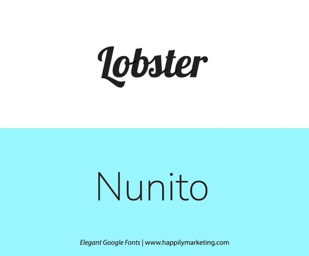
Lobster’s bold cursive style finds harmony with the simplicity of Nunito. Ideal for adding a touch of personality to branding materials or creative blog headers.
Satisfy and Poppins
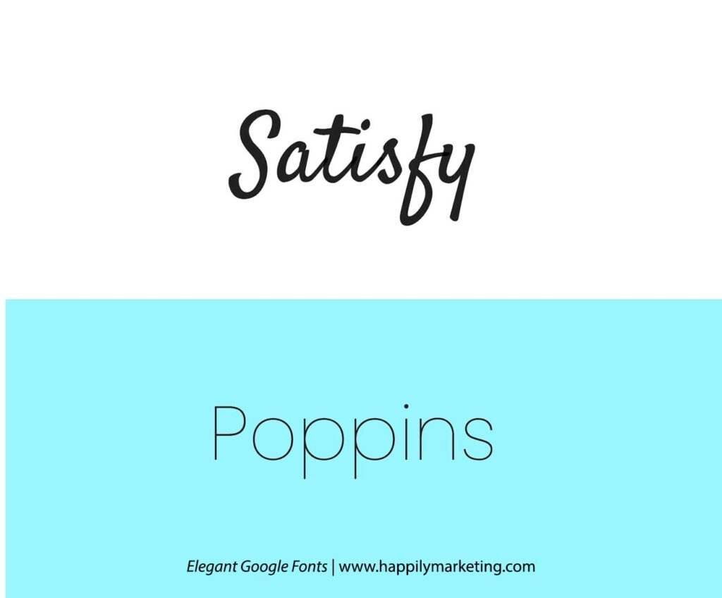
Satisfy’s casual cursive appeal combines seamlessly with the modern and geometric Poppins. Perfect for projects that seek a balance between creativity and a minimalist aesthetic.
The selected Google Font pairings leverage contrast and harmony, providing designers with a toolkit for creating elegant and readable content.
The Essence of Elegance in Typography
Elegance in typography is often a dance of form and function where both aesthetic and readability play crucial roles. An elegant font usually exhibits certain characteristics that include:
- Serifs: Traditional serifs add a touch of formality and structure.
- Stroke Variation: Delicate changes in stroke weight convey sophistication.
- Proportion: Tall ascenders and descenders contribute to a graceful appearance.
Elegant fonts do not merely serve decorative purposes; they ensure clarity and ease of reading.
Typographers may employ such fonts for various uses, from book typesetting to logo design, where they contribute to an overall impression of quality and refinement.
| Features | Description |
|---|---|
| Serifs | Enhance readability and formality. |
| Stroke Variation | Impart visual interest. |
| Proportion | Affect legibility and style. |
Choosing the right elegant font pairing demands consideration of contrast and harmony.
Elegance is achieved not simply through the individual merit of a typeface but also through its context and how it interacts with other design elements.
It should seamlessly blend into the design, speaking to the audience with an air of sophistication without drawing undue attention to itself.
How to Choose Fonts Like a Professional
Choosing fonts like a professional requires a delicate balance of contrast and harmony, prioritizing readability and brand identity.
Font psychology
It plays a crucial role, as serif fonts convey tradition and reliability, while sans-serif fonts offer a modern, clean look. Professionals analyze typeface compatibilities, seeking combinations that reflect brand identity cohesively.
Technical considerations
Technical considerations include ensuring readability, optimizing for web performance, and adhering to font licenses. In this post, we’ve explored elegant Google fonts that seamlessly blend style and legibility.
When integrating these combinations, focus on enhancing readability and adhering to accessibility standards.
Font Integration
Integrating fonts into design profoundly influences overall branding and design language. Consistent and purposeful font usage communicates the personality and essence of the brand, contributing to a cohesive visual identity.
Consider the sleek professionalism of sans-serif fonts or the timeless elegance of serifs, each shaping the viewer’s perception.
Readability of the fonts
Optimizing for readability is essential. Maintain optimal contrast between text and background colors for ease of reading. Recommended pairings like Roboto and Lora offer clear legibility with ample line spacing for better text flow.
Adhering to accessibility standards ensures screen-reader-friendly fonts, adjustable text for various devices, and compliance with web guidelines. Explore these considerations to choose fonts like a professional, enhancing both aesthetics and functionality in your design projects.
Conclusion
Selecting the right Google Font combinations can significantly enhance the readability and aesthetic appeal of any digital content. Throughout this article, designers have discovered elegant pairings that bring out the best in both serif and sans-serif fonts.
You as a graphic designer is now equipped with a variety of options for their next design project, each offering distinctive feels and functionality.
Whether aiming for minimalism or expressive typography, the combinations discussed serve as a solid foundation.


