70s color palette
If you rearrange your house, bar, or coffee shop, you must know that handmade crafts, vintage photos, or goods create nostalgia. This old stuff in your collection becomes a statement piece of the place, giving old-school aesthetics and adding traditional visuals to your place.
Vintage vibes are created not only by things but also by colors. 70s color palette provides overwhelming hues for you to try. These vintage color palettes style your graphic design from bold diner scenes to subdued, muted, and neutral colors captured on film cameras.
Anything with grainy, faded, or muted shades gives the vintage retro look; even though any mix of colors won’t look stylish, the color palette must reflect a unique retro style. But, according to your wallpaper color palette, it can be fun and inviting, or the way you incorporate designs or match colors makes it easy for the visitor.
So if you are searching these 70s color palettes for graphic design through old posters, records, films, and other places and need help finding hex codes, here are the 70s color palettes from dreamy hues to the electrifying disco era.
70s color palette with hex codes
The 70s color palette typically contains earthly tones to any color shades of vibrant hues, from electric blues and greens of the disco era to tonnes of the hippie movement. It was a decade of bold color palettes and shades.
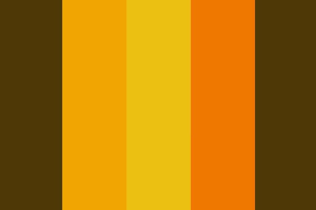
70s color palettes had muted shades of brown, green, and orange and brighter colors like yellow, pink, and purple. In that era, these colors were used in clashing prints and loud patterns that pop unique branding.
Even today, it is considered stylish and unique. Almost all classic 70s color palettes return, while brighter shades fail to join. The following color palettes are provided in high quality (HD 1920 * 1080px)

Best 70s Color Palette For You
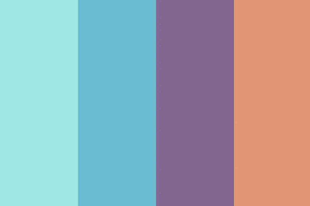
A wide range of vibrant hues defined the color palette of the 1970s. From the electric blues and greens of the disco era to the warm earth tones of the hippie movement, the 1970s was a decade of bold color choices.
In fashion, these colors were often seen in clashing prints and loud patterns. In interior design, they were used to create bold and unique spaces. And in art, they helped to define the pop art movement.
Today, the color palette of the 1970s is still considered to be unique and stylish. And while some of the brighter shades may have fallen out of favor, many of the more classic 70s colors are making a comeback in fashion and design.
These high-quality (HD 1920×1080 px) images can also serve as wallpapers for devices running on iOS, Android, or Windows operating systems!
Color Palette Number 1
Color Palette Number 2

Color Palette Number 3

Color Palette Number 4

Color Palette Number 5


Color Palette Number 6
Color Palette Number 7

Color Palette Number 8

Color Palette Number 9

Color Palette Number 10
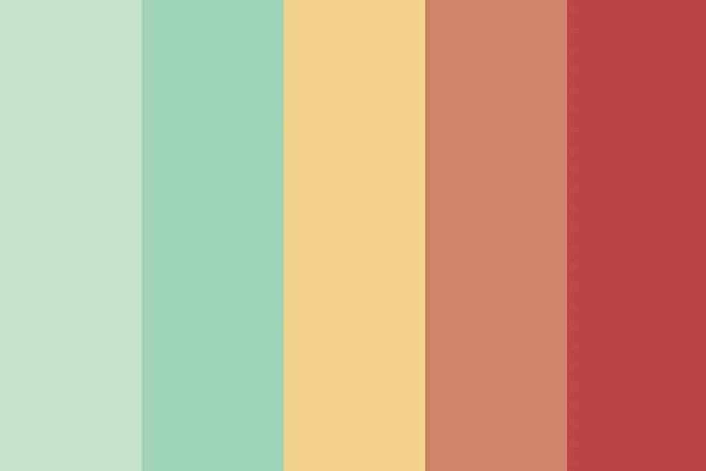
70s Palette Number 11

Color Palette Number 12

Color Palette Number 13
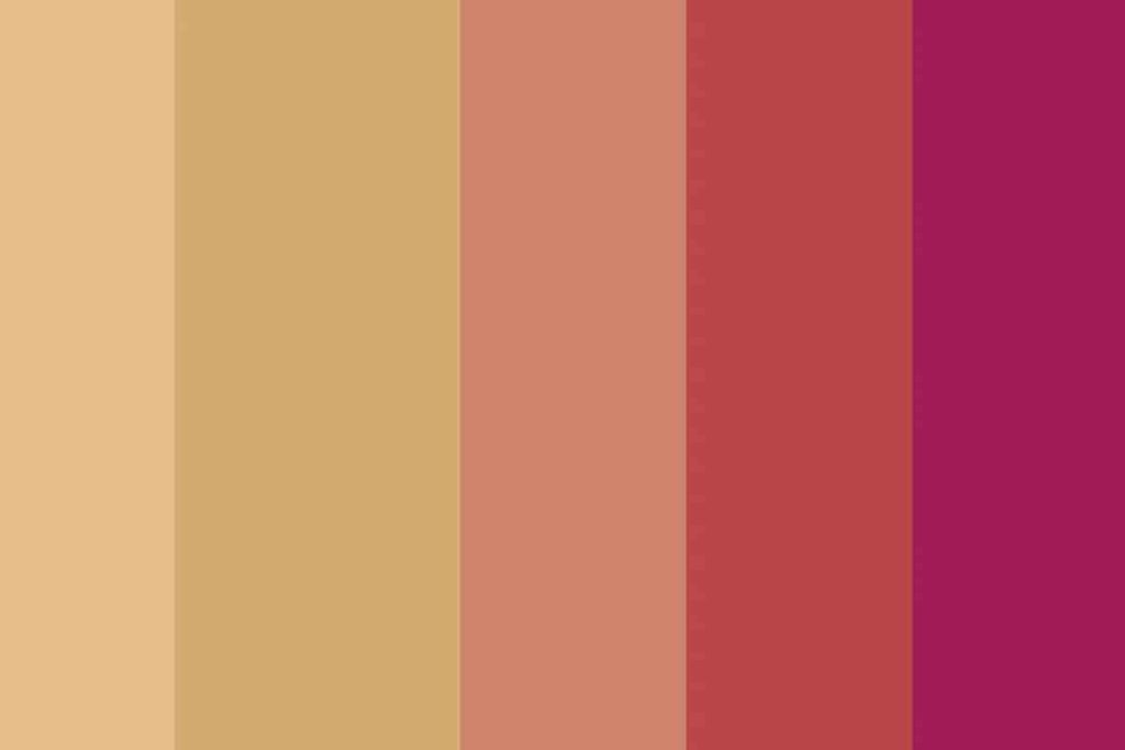
Color Palette Number 14

Why do you need vibrant hues of the 70s in your graphic design?
The key benefits of using a 70s color palette in your graphic designs are,
Give out nostalgia
The people who lived in the 70s or were influenced by it can bring back memories, hence get inspired by this 70s color palette.
Statement colors
The colors of the 70s reflect boldly and popping visuals that are very hard to forget. An essential mix can be attention-grabbing, making your graphic designs stylish.
Comment retro note
Get inspiration from the 70s color palette and create retro vibes in your graphic design. An old-school design that will make you stand out from others.
Open for experimentation
If you want, try out different textures and create your templates. It is no surprise that these colors let you work with imagination.
Why you shouldn’t use a 70s color palette in your graphic designs?
Even though there are many benefits of using this palette, you should avoid using them in certain circumstances, here are some tips which may save you.
Not appealing as modern colors
If you have worked with modern colors, you must know that modern colors are more appealing to vision than the 70s color palette. Also, they were popular in the 70s era, and that may not apply here.
Overwhelming colors
As discussed above 70s color palette include bold colors; using too many bold colors may be overwhelming. If you are working on such a project, try incorporating them in the design with muted ones.
Not all-inclusive
If you are inspired to create a project with a 70s color palette, remember that not all themes suit these colors. Examples like minimalistic brand design would not fit the color scheme of the 70s color palette.
Not moving with the trend.
You must go with the flow if you want to sell your designs. Currently, companies’ logos are inspired by minimalism and modernism. Move to modern colors if you think it is not the best fit.
Every brand has a target audience; if you feel your audience will love 70s branding, you feel out of place because of other brands. Even though the modern and minimalistic colors are trendy, the 70s color palette is used by many renowned brands.
See: Retro Color Palettes 101: Add a Vintage Twist To Designs
Here are some brand logos that are inspired by the 70s color palette.
Harley-Davidson
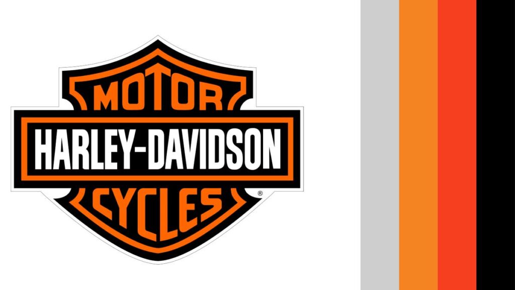
The brand ages over 100 years of experience; hence, it prefers retro looks to modern looks, and the logo design of Harley-Davidson uses earthly tones, which helps maintain its classic look.
Pepsi
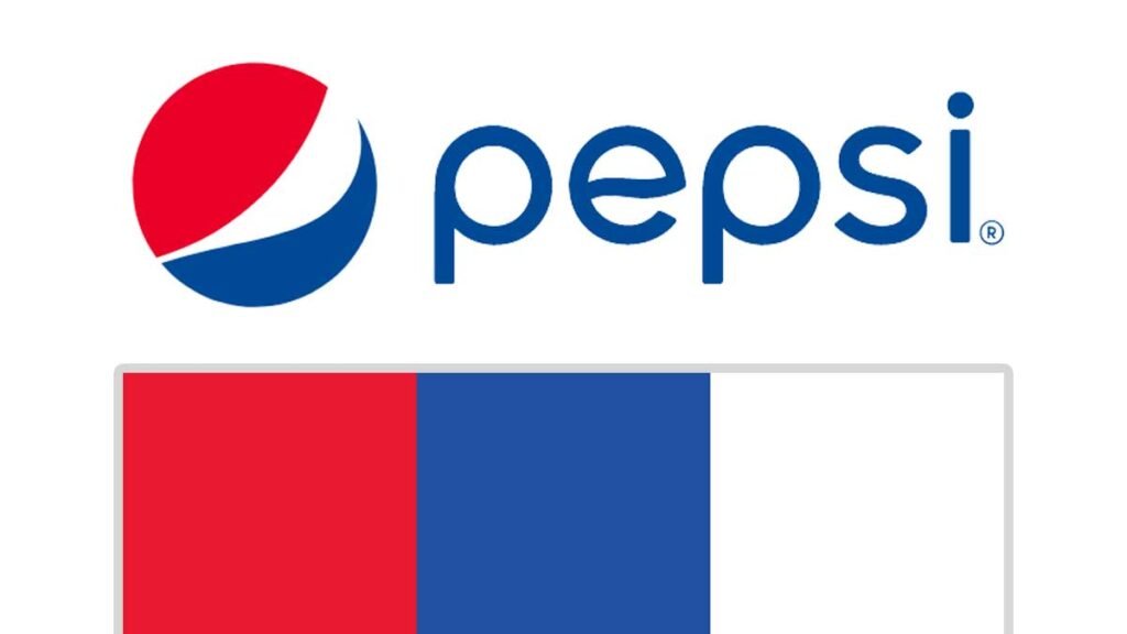
This company has also been around for more than 100 years. It also uses colors similar to that of Harley-Davidson. The use of these colors gives out retro and classic visuals to the brand.
Kraft
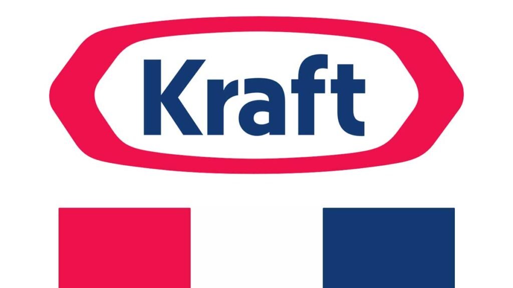
This is another company that uses a 70s color palette. It is a food company that has been functioning for almost 100 years. So to match the vibes, its logo is inspired by muted tones of many colors and brighter tones of yellow and red.
Conclusion
If you think of using retro shades in your designs, there is no comment. 70s color palette gives a sleek look between stylish retro and modern visuals. With many great color schemes, you can find your best fit.
Even if the browser is filled with 70s color palette search history, the final decision boils down to personal preference. Try to calculate the overall look and what you expect from the project, try it out on templates, so and so; there are many tips you can follow.
The important thing is that you shouldn’t shy away from using 70s colors.

Take a look at our other blog posts below.
Read More :
- 21+ Socks Mockup for You to Market and Sell Your Designs!
- 15 Elegant Feminine Fonts For Logos
- 20 Fancy Old Fashioned Font List For Your Next Design


