What is Minimalist Graphic Design:
Minimalist graphic design is a trend that has been growing in popularity over the last few years. Minimalism is characterized by simplicity, with an emphasis on function and efficiency.
This blog post will discuss why designers like the minimalist graphic design; what it means to be minimalistic in terms of graphic design; how it can help your business; and why people prefer minimal designs. Minimalist graphics are efficient, simple, and often more creative than complex ones.
Minimal graphics are easy to understand, which makes them easier for viewers.
Minimalist designs tend to go hand in hand with cleanliness and organization because items are carefully selected based on their purpose. Minimalism is also considered an art form; it can be used to create emotion or tell a story.
What is minimalism in graphic design?
Minimalism does not always mean less. It often entails a concentration on the essential, elevating what is needed and ignoring nonessential elements.
The minimal design embraces “less.” Sometimes it means less color, fewer fonts to choose from, or a simple grid as an organizational device.
More often than not, though, minimalism means finding order in what might seem like chaos. In its own way, minimalist design can be very complicated because it makes decisions about how to make something look easy which are sometimes difficult.”
“Less.” So much less clutter—not just on your desk, but also in your brain! Simple lines let you focus on the essentials—which makes you more effective at work and happier outside of work!
When you are looking for a balance between design and content, minimalist designs can be an excellent choice. Here is how they work: when creating your next project make sure to follow these key rules of minimalism in graphic arts!
For example, if the empty spaces around elements on screen or paper seem too stark there may not be enough contrast with other aspects which could lead people to feel overwhelmed instead of just bored by what they see as opposed to being engaged emotionally.
Balance isn’t always easy but remembers this about all types type styles – Keep it Balanced!!!
Why is minimalist graphic design good?
The good graphic design relies on the viewer’s perceptions to create meaning. It is difficult to realize this with graphics that are busy and cluttered with words, so minimalism forces the viewer to take more time looking at the picture before being able to interpret it.
Good graphic design also gives viewers something they can connect with–and everyone knows how frustrating it feels when you’re trying to connect your thoughts about a subject but there aren’t any symbols or images you know besides rigid geometric ones.
Colorful, organic shapes evoke emotions without words, which allows viewers of all ages and backgrounds to perceive visual stories more effectively.
Contrastingly, minimalism leaves room for interpretation by focusing purely on color and shape while omitting extraneous details.
Read about Subliminal Messages in Advertisements
What is minimal design for a website?
Minimal design usually means getting rid of everything that’s not essential. For websites, this may mean removing certain sidebar items, backgrounds, large text on the page, etc.
More minimal designs aim to get visitors to focus on the site content and scroll through more quickly – they don’t want to be distracted by an above-average number of distractions for too long.
If we talk about minimalism in web design, it plays with the user’s moods in order for him/her never to get bored or frustrated with the website meaning you need to make sure your content is captivating enough so they will feel inclined to stay longer on your site.
Ensuring good navigation in a way that is smooth and makes sense with just a couple of clicks without any hassle or fuss.
What are the 3 characteristics of minimalism?
- It’s an art form, not a fashion statement.
- The true minimalist hates clutter.
- The journey of minimalism is about subtracting until your needs fit in the small space you live in – and then realizing that there wasn’t anything wrong with your life before you started going without things.
The first characteristic of minimalism is its simplicity. Minimalism does not require people to buy less; it encourages buyers to redirect their spending and carefully consider what they’re buying next.
Essentially, people who take on the minimalist lifestyle are still able to enjoy all of the things that make them happy – they just prioritize these items and reevaluate their attitude and thought process before deciding how much money should be spent on each item.
The second point about minimalism is its intentionally sparse aesthetic expression. The goal of this expression is for you to recognize that your time or energy can go towards something else like art or cultivating yourself in some other respect (even if you don’t want to).
Minimalism isn’t about focusing on what you don’t have, it’s about shifting your attention towards how much more there is in life besides materialistic objects.
The third point is that the journey of minimalism starts when individuals actually start learning something new and stop buying things they don’t really need which then leads to them realizing that they don’t need to buy things in order for them to be happy.
Minimalism is about finding happiness by taking away unnecessary items and focusing on what really matters – which isn’t materialistic or superficial at all.
Do people prefer minimalistic graphic design?
Surprisingly, I don’t think there is a definitive answer to this question. Some people like minimalistic design because it is simple and they do not need to spend time reading the content.
Other people enjoy when certain things about their environment are more detailed and they can see patterns or shapes in the design.
Examples of Minimalist graphic design
Minimalist graphics are in style, with plenty of recent examples to show you how it’s done.
Let’s take a look at some really awesome people who have mastered this trend and inspired us to do this blog post – from logos for companies or organizations all the way down to typography and photography!
These are some of the best Minimal Movie Posters


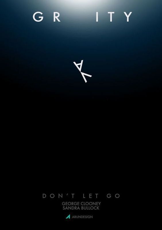
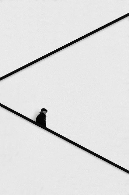
These are a few of the minimalism inspired photographs


Last but not the least, a few of my fav logo designs that have been smartly done using the concept of minimalism



Minimalism is a trend, not just in design but also as a lifestyle. Minimalist Graphic Design is just a part of it. It has been around for centuries and will continue to be popular because it creates an environment that allows us to focus on important things without distractions.
This isn’t about designing with fewer elements–it’s about expressing big ideas with fewer pieces of information. The key aspects of minimalism are simplicity and reduction; these principles can help you create content that grabs attention or introduces your brand to new audiences. Have you tried any of these minimalist designs?
Read More:

