In the realm of typography, finding the perfect font for your project can be a challenging task. If you’ve ever been captivated by the clean and modern aesthetics of Segoe UI, you might have found yourself searching for “fonts similar to Segoe UI”.
This blog post is designed to help you in that quest. We’ll explore a variety of typefaces that echo the simplicity and readability of Segoe UI, providing you with a range of alternatives to consider for your next design project.
Whether you’re creating a sleek website, an engaging presentation, or a professional document, these Segoe UI-like fonts could be just what you’re looking for.

Table of Contents
- Top Fonts Similar to Segoe UI
- Factors to Consider When Choosing Fonts
- Resources for Font Selection
- Final words
- Read More
Top Fonts Similar to Segoe UI
When it comes to finding fonts similar to Segoe UI, there are several options available. Here are some of the top fonts that are similar to Segoe UI:
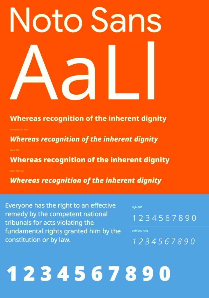
Noto Sans
Noto Sans is a sans-serif font family designed by Google. It was created to provide a clean and legible font for all languages. Noto Sans is very similar to Segoe UI in the lowercase format. In lowercase, they are almost exact matches. However, Noto Sans has a slightly wider spacing between letters than Segoe UI.

Open Sans
Open Sans is a sans-serif font family designed by Steve Matteson. It is a humanist font that is very legible and easy to read. Open Sans is similar to Segoe UI in terms of its clean and modern look. It has a slightly wider spacing between letters than Segoe UI, but it is still a good alternative for those who want a font that is similar to Segoe UI.

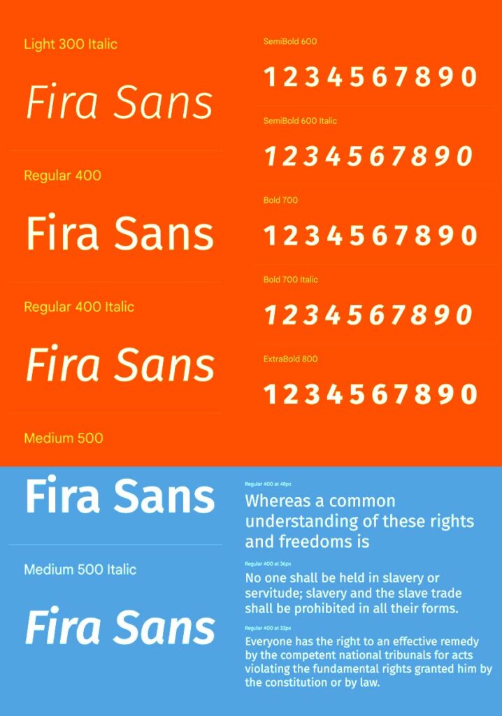
Fira Sans
Fira Sans is a sans-serif font family designed by Carrois Apostrophe. It is a modern and versatile font that is suitable for a variety of applications. Fira Sans is similar to Segoe UI in terms of its clean and modern look. It has a slightly narrower spacing between letters than Segoe UI, but it is still a good alternative for those who want a font that is similar to Segoe UI.

Roboto
Roboto is a sans-serif font family designed by Christian Robertson. It is a modern and versatile font that is suitable for a variety of applications. Roboto is similar to Segoe UI in terms of its clean and modern look. It has a slightly narrower spacing between letters than Segoe UI, but it is still a good alternative for those who want a font that is similar to Segoe UI.

Arial
Arial is a sans-serif font family designed by Robin Nicholas and Patricia Saunders. It is a popular font that is widely used in both print and digital media. Arial is similar to Segoe UI in terms of its clean and modern look. It has a slightly wider spacing between letters than Segoe UI, but it is still a good alternative for those who want a font that is similar to Segoe UI.
Helvetica
Helvetica is a sans-serif font family designed by Max Miedinger. It is a classic font that has been around for over 50 years. Helvetica is similar to Segoe UI in terms of its clean and modern look. It has a slightly narrower spacing between letters than Segoe UI, but it is still a good alternative for those who want a font that is similar to Segoe UI.
Overall, these fonts are great alternatives to Segoe UI. They have a similar look and feel, making them suitable for a variety of applications. Whether you are designing a website, creating a presentation, or working on a document, these fonts will provide you with the clean and modern look that you need.
Factors to Consider When Choosing Fonts
When choosing fonts for a project, there are several factors that should be taken into consideration. These factors include readability, compatibility, and aesthetic appeal.
Readability
One of the most important factors to consider when choosing a font is its readability. A font that is difficult to read can make it challenging for users to engage with the content. Therefore, it is essential to select a font that is easy to read, even at smaller sizes.
To ensure readability, it is recommended to choose a font that has clear and distinguishable characters. Fonts that are too thin, too bold, or too decorative can make it difficult to read the text. It is also important to consider the spacing between letters and lines, as well as the contrast between the text and the background.
Compatibility
Compatibility is another important factor to consider when choosing a font. Fonts that are not compatible with different devices and browsers can result in a poor user experience. Therefore, it is important to choose a font that is compatible with different platforms and devices.
To ensure compatibility, it is recommended to choose a font that is available on different platforms and devices. For example, choosing a font from the Google Fonts library can ensure that the font is compatible with different devices and browsers.
Aesthetic Appeal
The aesthetic appeal of a font is also an important factor to consider when choosing a font. A font that is visually appealing can make the content more engaging and memorable. However, it is important to ensure that the font matches the style and tone of the project.
To ensure aesthetic appeal, it is recommended to choose a font that matches the style and tone of the project. For example, a modern and sleek font may be more appropriate for a tech-focused project, while a more traditional and elegant font may be more appropriate for a luxury brand.
Overall, choosing the right font is crucial for creating a successful project. By considering factors such as readability, compatibility, and aesthetic appeal, designers can select a font that enhances the user experience and effectively communicates the message of the project.
Resources for Font Selection
When selecting a font for a project, it’s important to consider the style and aesthetic of the design. Fortunately, there are many resources available for designers to find the perfect font. This section will cover two of the most useful resources: online font libraries and font pairing tools.

Online Font Libraries
Online font libraries provide designers with a vast selection of fonts to choose from. Some of the most popular font libraries include Google Fonts, Adobe Fonts, and Font Squirrel. These libraries offer a wide range of font styles, weights, and languages, making it easy for designers to find the perfect font for their project.
Google Fonts is a popular choice for designers because it offers a large selection of free fonts that can be easily integrated into web designs. Adobe Fonts, on the other hand, offers a more premium selection of fonts that can be synced across multiple devices. Font Squirrel is another great option for designers who are looking for high-quality, free fonts.
When selecting a font from an online library, it’s important to pay attention to the licensing requirements. Some fonts may require attribution or may not be suitable for commercial use.
Font Pairing Tools
Font pairing tools can be incredibly helpful for designers who are struggling to find the perfect combination of fonts. These tools analyze the characteristics of different fonts and suggest pairings that work well together.
One popular font pairing tool is Type Genius, which allows designers to select a font and then suggests complementary fonts based on the selected font’s characteristics. Another great tool is Fontjoy, which uses machine learning algorithms to suggest font pairings based on a designer’s preferences.
When using font pairing tools, it’s important to consider the overall style and aesthetic of the design. While the tool may suggest a pairing that works well together, it may not necessarily fit the specific design project.
In conclusion, when selecting a font for a project, designers should consider using online font libraries and font pairing tools to help find the perfect font. These resources can save time and provide valuable insights into the characteristics of different fonts.
Final words
In conclusion, the Segoe typeface, best recognized for its extensive use by Microsoft, offers a clean and modern aesthetic that has made it a popular choice in both digital and print mediums. As we’ve explored in this blog post, there are some great “fonts similar to Segoe UI” available which capture its essence while offering their unique nuances.
Despite Segoe’s ubiquitous presence in Microsoft’s product logos, applications, and even its corporate logo, these alternatives provide a refreshing diversity for designers looking to break from the mold while retaining the appealing characteristics of Segoe UI.
Whether you’re designing for an operating system interface, an email service platform, or any other application, these Segoe UI-like fonts can help elevate your project to new design heights.
Read More
Thrasher Font Download A Stylish Typeface for Your Creative Projects
21 Best Fonts For Jewelry Logo: Top Options For You Today
Gatorade Font Download Now For Free – 2023
11+ Best Tattoo Fonts for Men to Get Inked In Style


Wonderful blog! I found iit while searchng
on Yaho News. Do you habe any suggestions on how to get listed
in Yahoo News? I’ve been trying ffor a while but Inever seem to get
there! Appreciate it
Also visit my web page; Chadwick