Serif fonts are a classic choice for typography, often used in printed materials such as books, newspapers, and magazines. They have small lines or flourishes at the end of each character, which can help guide the reader’s eye along the text and improve readability.
These Popular Serif Fonts are known for their traditional and elegant appearance, making them a popular choice for formal documents and invitations.
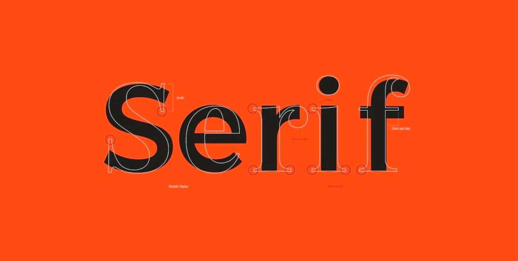
Understanding serif fonts and their characteristics can be helpful in choosing the right font for a project. Some serif fonts are more traditional and classic, while others have a more modern and contemporary feel. It is important to consider the purpose of the text and the intended audience when selecting a serif font.
For example, a more playful and rounded serif font may be appropriate for a children’s book, while a more formal and traditional font may be better suited for a legal document.
Table of Contents
Key Takeaways
- Serif fonts are a classic choice for typography, often used in printed materials such as books, newspapers, and magazines.
- Understanding serif fonts and their characteristics can be helpful in choosing the right font for a project.
- When selecting a serif font, it is important to consider the purpose of the text and the intended audience.
What are Serif Fonts?
A serif font is a typeface that features small lines or decorative flourishes at the ends of its characters. These small lines, known as serifs, can be found at the extremities of letters and symbols, providing additional detail and style.
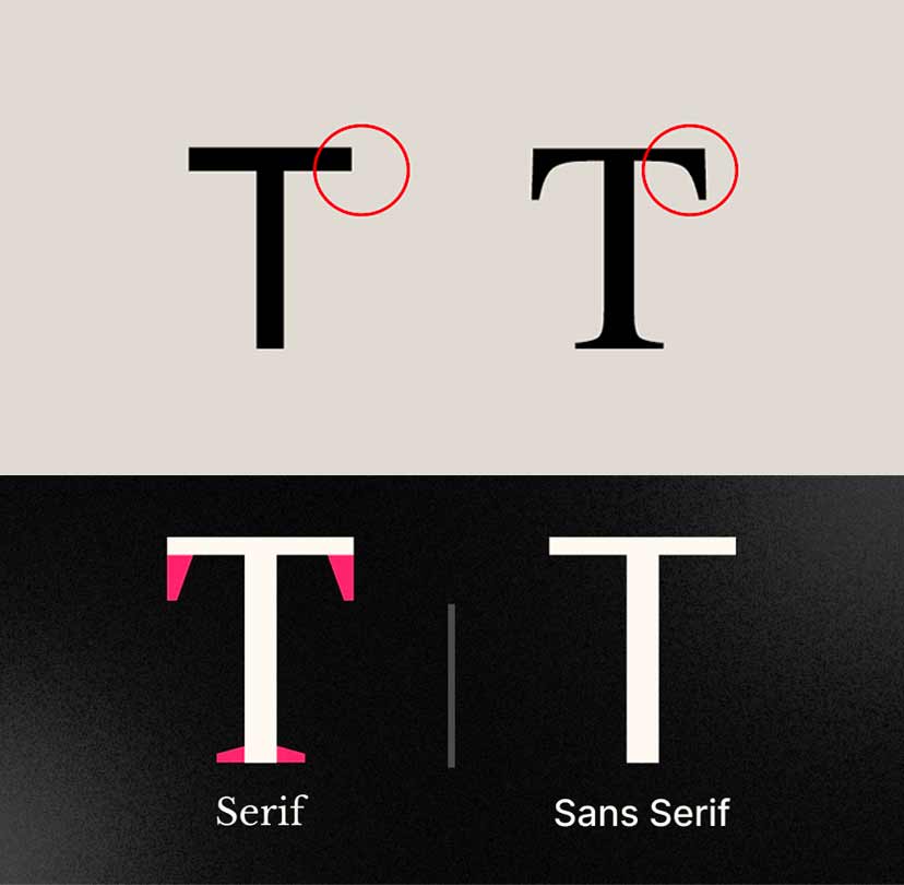
Serif fonts are often associated with a more traditional, formal, or classic aesthetic. The presence of serifs can enhance readability in printed materials, as the serifs guide the eyes along the text flow.
Serif fonts can be broadly categorized into two main groups: Old Style and Modern. Old Style serifs are characterized by a more organic and traditional appearance, showcasing diagonal stress in the strokes.
In contrast, Modern serifs display a more geometric and sharp design, emphasizing vertical stress in the letterforms.
Moreover, within the broader classification, serif fonts can be further divided into four subgroups: old style, transitional, Didone, and slab serif, organized based on their chronological order of first appearance and distinct stylistic features.
Top 10 Popular Serif Fonts
Serif fonts have been in use for centuries, and they continue to be popular in modern times. In this section, we will discuss the top 10 popular serif fonts used in various design projects.
Timeless Classics
Some serif fonts have stood the test of time and are still popular in contemporary design. These fonts are known for their elegance and legibility and are perfect for branding, logo design, magazines, posters, books, and invitations.
Times New Roman
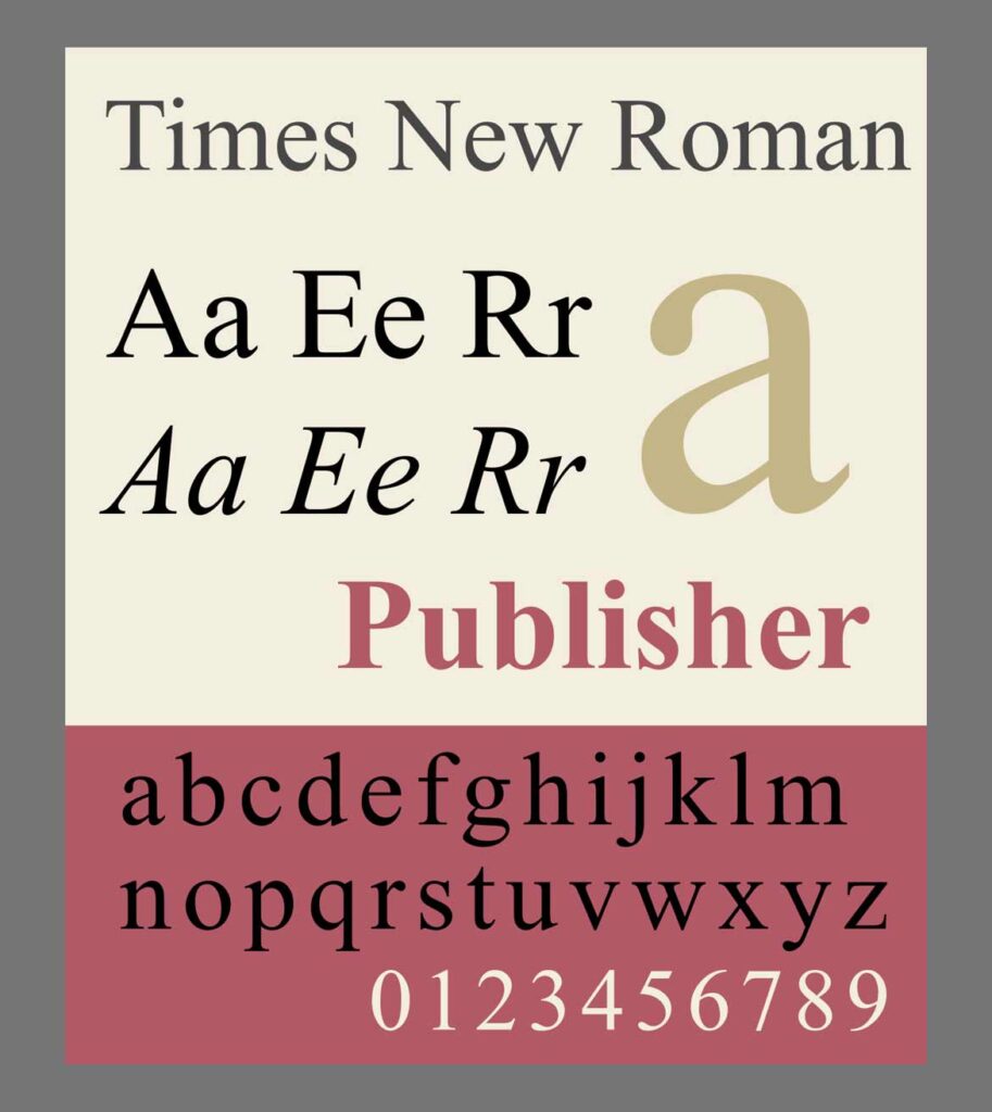
Times New Roman is the most popular serif font of all time. It was designed in 1932 and has been widely used in academic writing, newspapers, and books. Its popularity is due to its legibility and classic look.
Garamond
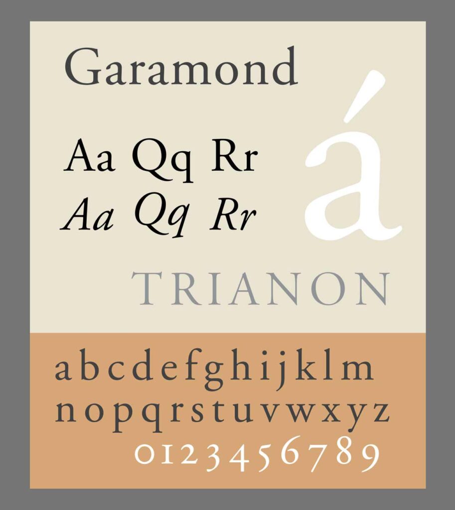
Garamond is a classic serif font that dates back to the 15th-16th century. It has a timeless elegance that makes it perfect for books and other printed materials. Its popularity is also due to its legibility and versatility.
Baskerville
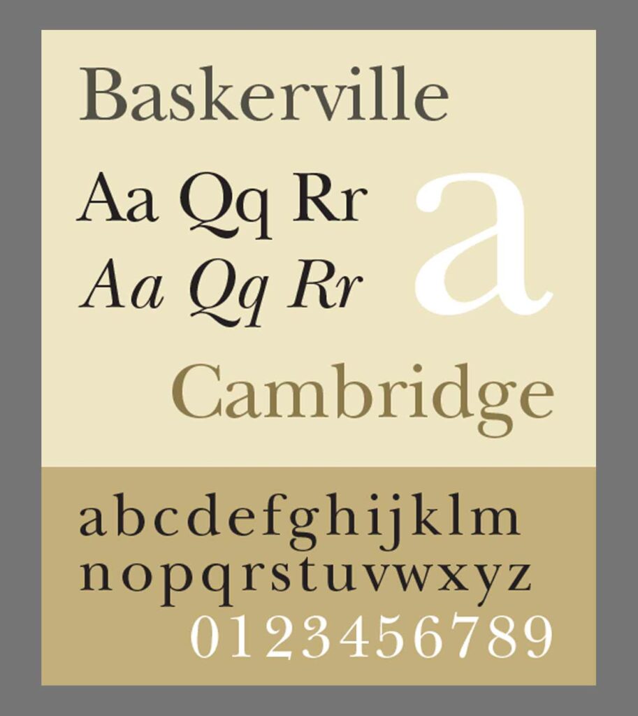
Baskerville is a transitional serif font that was designed in 1757 by John Baskerville in Birmingham. It is known for its elegance and is perfect for high-end branding and logo design.
Modern Serif Fonts
In recent years, modern serif fonts have gained popularity due to their unique and contemporary look. These fonts are perfect for headers, headings, and other design elements that require a modern touch.
Georgia
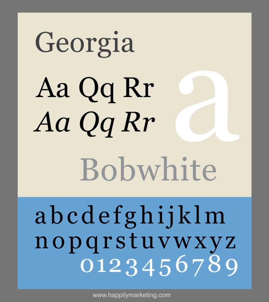
Georgia is a contemporary serif font that was designed in 1993. It is known for its legibility and is perfect for web design, as it looks great on screens of all sizes.
Merriweather
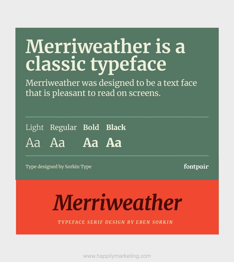
Merriweather is a modern serif font that was designed in 2011. It is known for its large x-height, which makes it easy to read even in small sizes. It is perfect for both print and digital design.
Lora
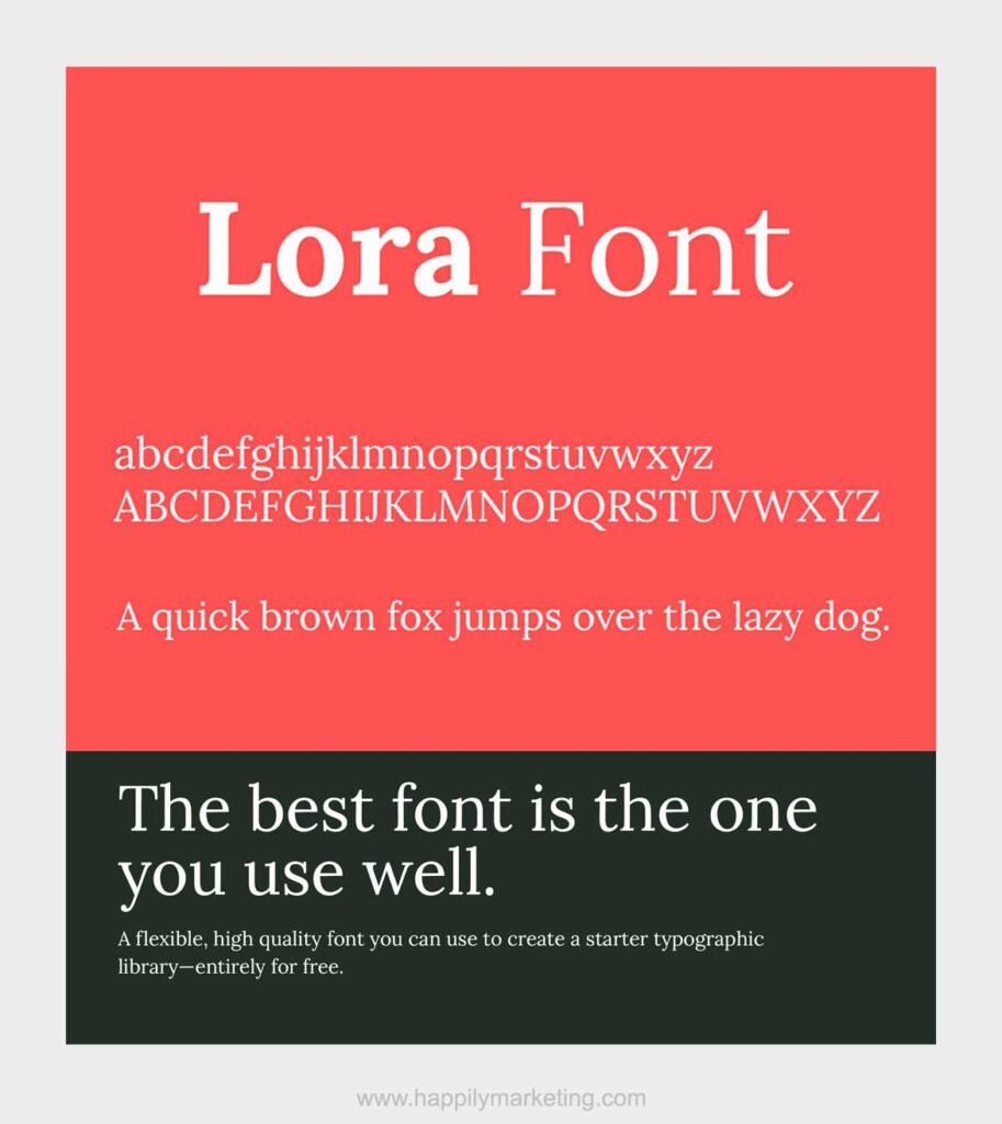
Lora is a unique serif font that was designed in 2011. It has a modern and elegant look and is perfect for branding and logo design.
Specialized Uses
Some serif fonts are perfect for specialized uses, such as display fonts or fonts for specific industries.
Noto Serif
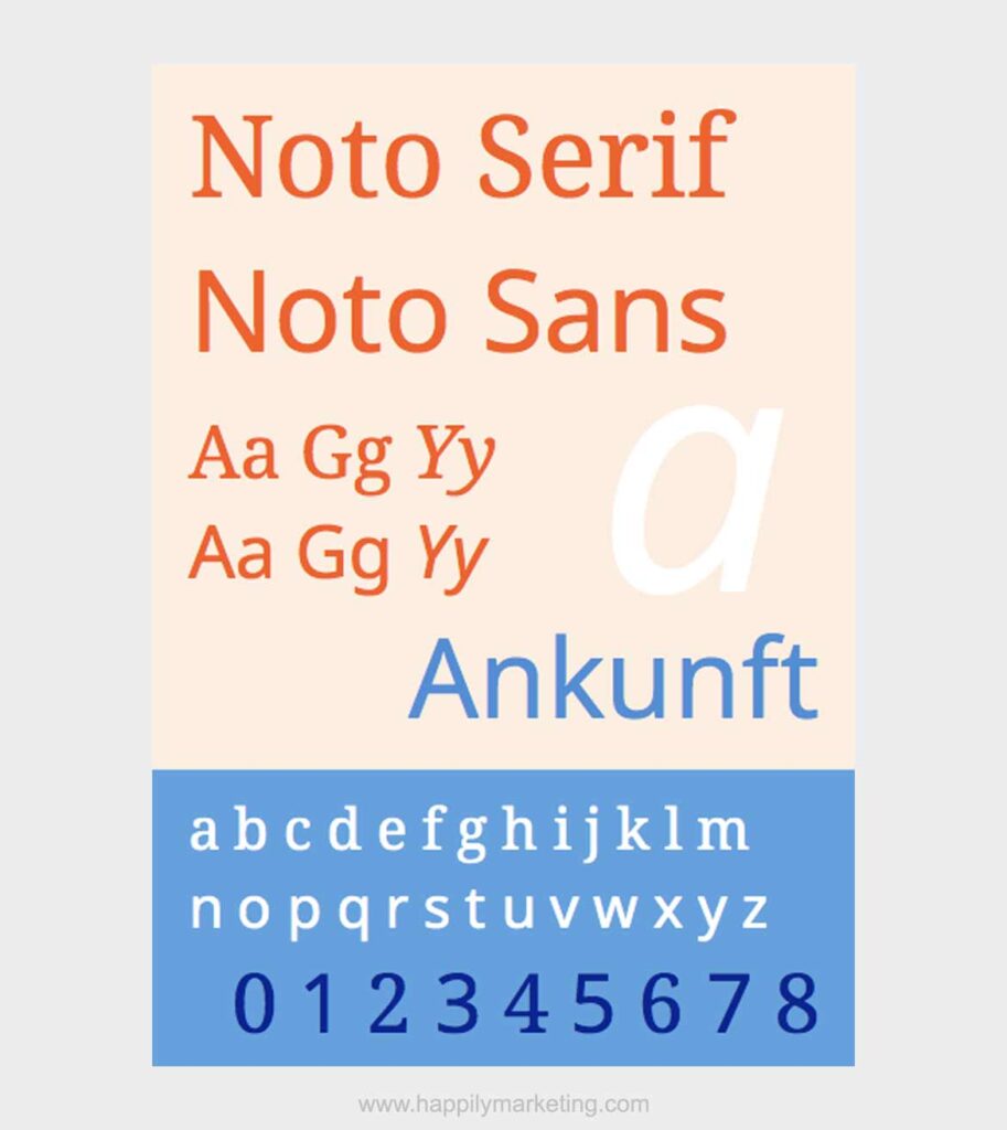
Noto Serif is a serif font designed for use in the technology industry. It is known for its legibility and is perfect for use in user interfaces and other digital design projects.
Palatino
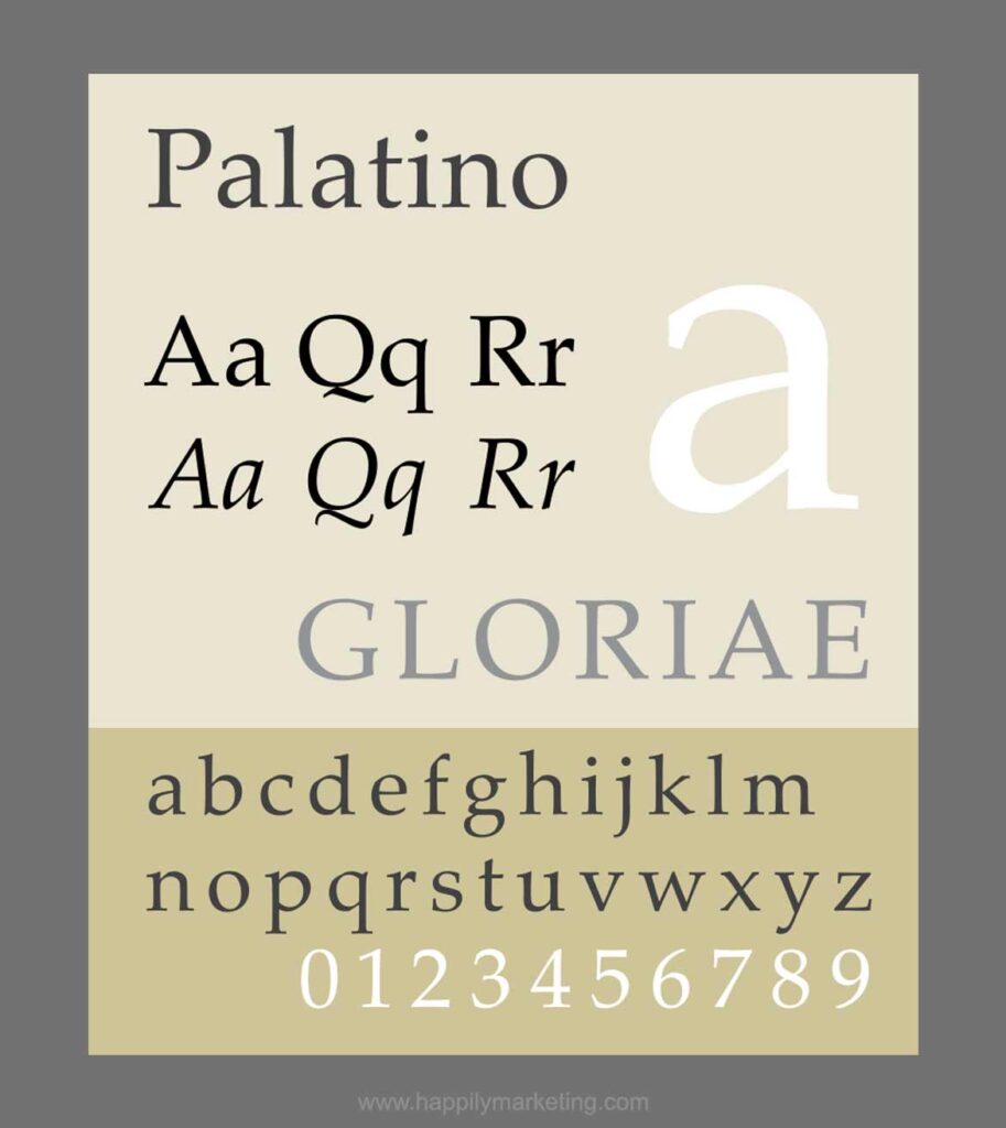
Palatino, designed by Hermann Zapf, is known for its legibility and elegance. Its distinctive features include a harmonious balance between straight lines and curves, making it versatile for both print and digital applications.
Didot
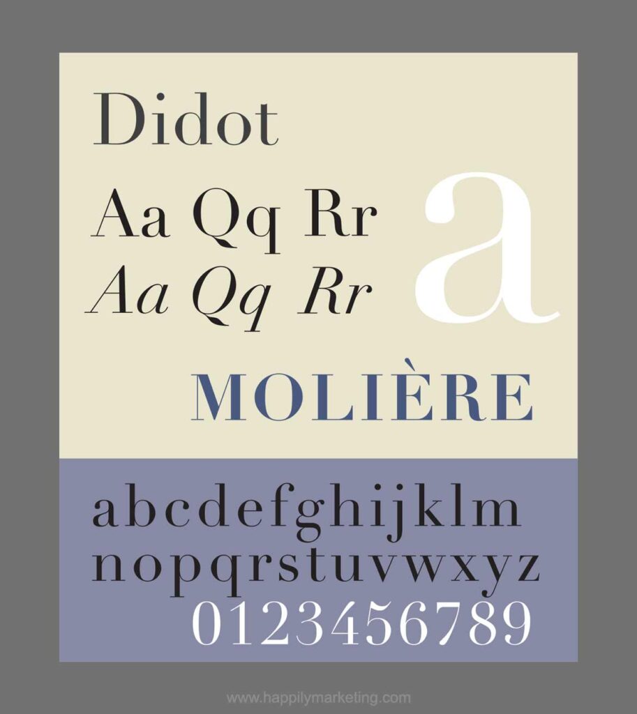
Didot, a high-contrast serif typeface, exudes a sense of sophistication and refinement. Renowned for its use in high-end fashion and editorial design, Didot’s thin and elegant strokes contribute to a luxurious aesthetic.
Crimson Text
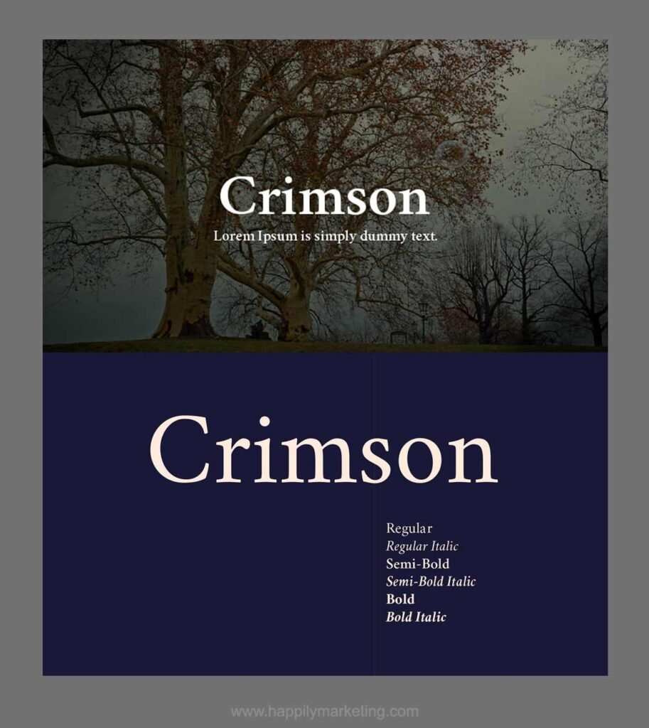
Crimson Text is a contemporary serif font designed for optimal reading on screens. Its open, well-spaced letterforms enhance readability, making it a popular choice for websites and digital publications while maintaining a classic appeal.
Understanding Serif Fonts
Historical Context
Serif fonts, also known as serif typefaces, have a rich history dating back to the 15th century. The serif typeface was first developed during the Renaissance period when typographers began to experiment with new styles of lettering.
The first serif typeface is attributed to Claude Garamont, a French typographer who created the Garamond font in the 16th century.
Serif fonts were widely used in print media during the 18th and 19th centuries. John Baskerville, an English printer and type designer, is credited with creating one of the most popular serif fonts, Baskerville, in the mid-1700s.
Serif fonts are still popular today, particularly in traditional print media such as books and newspapers.
Anatomy of Serif Fonts
Serif fonts are characterized by the small lines or flourishes that are added to the ends of the letters. These lines are called serifs and they give the font a more elegant and traditional look. Serif fonts are also known for their thin strokes and the contrast between the thin and thick strokes, which adds to their personality and classic appeal.
Another important aspect of serif fonts is the use of ligatures, which are two or more letters that are combined into a single glyph. Ligatures are used to improve the readability of the text and to add a touch of elegance to the font.
Serif vs. Sans Serif
Here is a short and easy comparison table for you.
| Feature | Serif Fonts | Sans Serif Fonts |
|---|---|---|
| Character | Small lines or strokes at character ends | Lacks small lines or strokes at ends |
| Readability | More readable in print | Better readability on screens |
| Usage | Common in print (books, magazines) | Popular for online content and websites |
| Aesthetics | Traditional, formal, classic | Modern, clean, minimalistic |
| Examples | Times New Roman, Georgia, Garamond | Arial, Helvetica, Calibri, Open Sans |
Apart from the differences shared in the above table, one of the main differences between serif and sans-serif fonts is the presence or absence of serifs.
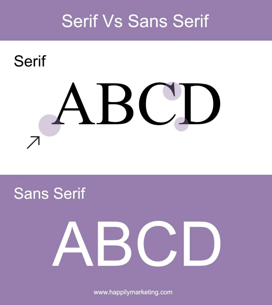
Sans-serif fonts, as the name suggests, do not have serifs and are characterized by their clean and modern look. Sans-serif fonts are often used in web design and on screens because they are more readable at smaller sizes.
Serif fonts, on the other hand, are more traditional and are often associated with elegance and sophistication. They are commonly used in print media, such as books and newspapers, because they are easier to read in longer blocks of text.
Serif fonts have a rich history and are still widely used today in traditional print media. They are characterized by their thin strokes, the contrast between thin and thick strokes, and the use of serifs and ligatures.
Sans-serif fonts, on the other hand, are more modern and are often used in web design and on screens because of their readability.
In conclusion, serif fonts continue to be popular in modern design despite their long history. Whether you need a classic, modern, or specialized font, there is a serif font out there that is perfect for your project.
Read More
15 Google Fonts For Fashion Websites: Style Up Your Site
21 Best Fonts For Jewelry Logo: Top Options For You Today
How Do Nomads Make Money in 2023? 17+ Top Strategies


