In the world of business, creating a brand is crucial. A brand is more than just a name or a logo; it’s an identity. The logo is the face of that identity and is often the first thing customers see. Therefore, it is essential to get it right.
A logo is a visual representation of a brand. It is a symbol that communicates what a company stands for and what it offers. In many ways, a logo is the most critical part of a brand’s identity. Creating a logo for small businesses can be daunting, especially if they need to familiarize themselves with the process.
This article will explore the dos and don’ts of logo design for small businesses. We will discuss what makes an excellent logo, common mistakes to avoid, and the best way for small businesses to get logo design services. So, let’s get started.
The Dos of Logo Design
Keep It Simple
One of the most critical aspects of logo design is simplicity. A logo should be easy to understand and recognize. It should be simple enough to be memorable and unique. Avoid complex designs, and focus on creating something easy to read and recognize. Simple logos are also more versatile and can be used across different media.
The Nike swoosh is an excellent example of a simple logo that has become instantly recognizable.
Do your first designs in black and white.
One important aspect to remember when designing a logo for your small business is to start with black and white designs. Although it may be tempting to dive straight into incorporating color and other design elements, beginning with black and white can help you focus on the overall structure and concept of the logo.
By eliminating the distraction of color, you can better assess the logo’s strength in shape, font, and message. It can also help ensure that your logo will look great in various settings, such as when printed in black and white or viewed on a small screen. Once you have a solid design in black and white, you can experiment with colors and other elements to make it stand out.
Use Appropriate Colors
Colors can have a significant impact on how people perceive a brand. Different colors can evoke other emotions and feelings. Therefore, it is essential to choose colors that are appropriate for the brand’s message and values.
For example, red is associated with energy and passion, while blue is associated with trust and reliability. McDonald’s is an excellent example of a brand that uses color effectively. The yellow and red combination is instantly recognizable and associated with the fast-food chain.
Make It Scalable
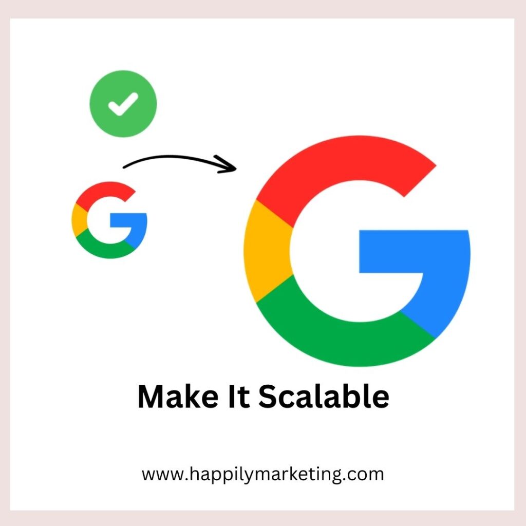
A logo should be scalable, which means it should look great in any size, from a tiny favicon to a billboard. A scalable logo is essential because it will be used across various media, including business cards, websites, and social media platforms.
A great example of a scalable logo is the Coca-Cola logo, which looks great in any size and is instantly recognizable.
Keep It Timeless

A great logo should be timeless. It should be relevant now and in the future. Avoid trends and fads that may fade away with time. A timeless logo will stand the test of time and continue to be relevant for years.
The FedEx logo is an excellent example of a timeless one, designed in 1994, and still looks fresh and relevant today.
Tell A Story
A great logo should tell a story. It should communicate what the brand is all about and what it stands for. For example, a logo should be unique and differentiate the brand from its competitors.
For example, the Amazon logo tells a story. The arrow from A to Z represents the company’s commitment to offering everything from A to Z.
Do Test Your Logo
Once you have designed your logo, testing it in different contexts is essential to ensure it’s effective. Your logo should look great in various sizes and mediums, such as on a website, business card, or billboard. It should also be effective in black, white, and color.
Testing your logo with your target audience can also be helpful. Get feedback on what they think of the design and whether it accurately represents your brand. You can also test your logo against competitors to see how it stacks up.
- Why A Logo Is Important For A Brand: The Power of a Logo.
- Logo Of Branded Clothes: The Ultimate List of Top 10
- How Does A Logo Attract Customers?
The Don’ts of Logo Design
Don’t Use Clip Art
The clip art is not appropriate for logo design. The clip art is generic and can be easily replicated. A logo should be unique and should differentiate the brand from its competitors.
Don’t Use Too Many Colors
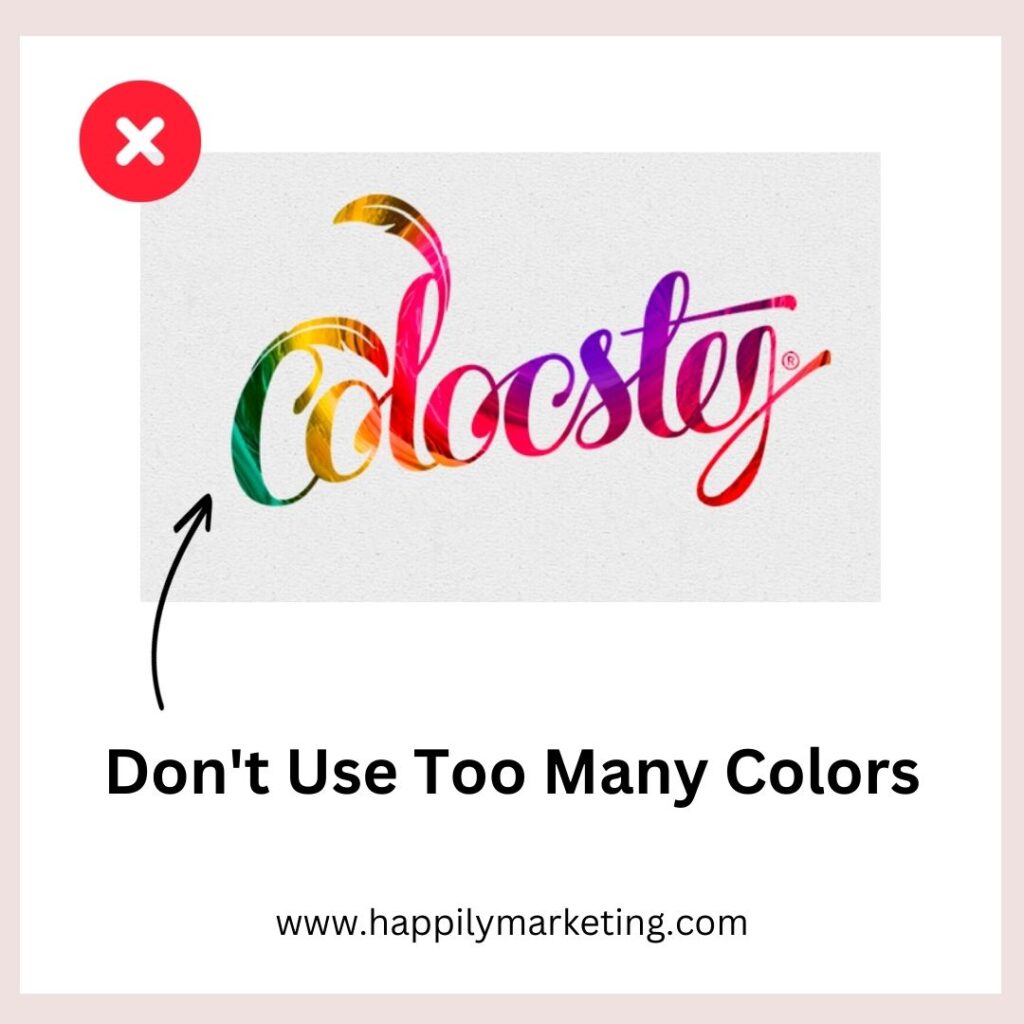
Using too many colors can make a logo look cluttered and confusing. Stick to a maximum of three colors to keep it simple and memorable.
Don’t Use Too Many Fonts
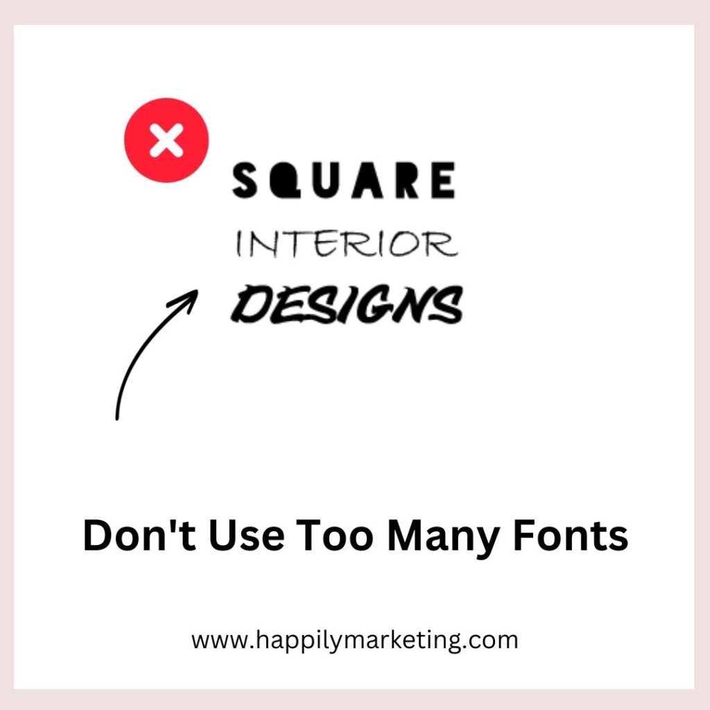
Using too many fonts can make a logo look unprofessional and cluttered, instead, stick to a maximum of two fonts to keep it simple and easy to read.
Do not use Drop Shadow.
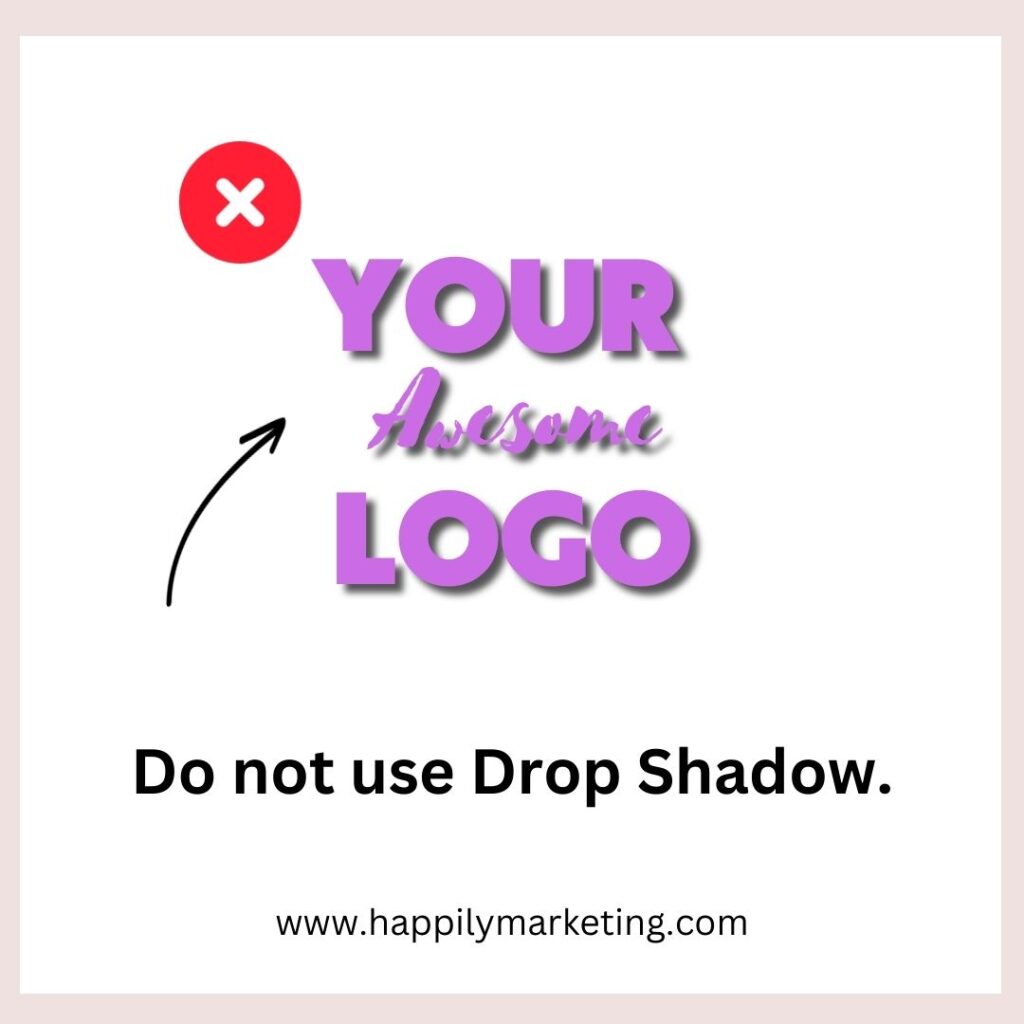
In logo design, using drop shadows can be tempting, but it is usually not a good idea. As discussed in this post, The Dos and Don’ts of Logo Design for Small Businesses, drop shadow can make a logo look outdated and amateurish. Also, drop shadows can cause issues when the logo is reproduced in different sizes or backgrounds. Therefore, it is recommended to avoid using them in logo design.
Don’t forget to get a second opinion
After creating a logo design for a small business, getting feedback from others is essential. It’s important to show the plan to people not directly involved in the design process, such as customers, colleagues, or friends. This helps to get an outside perspective on the logo and how others perceive it.
Don’t Overcomplicate Your Logo
One of the most common mistakes in logo design is overcomplicating the design. While adding intricate details, numerous fonts, or many colors may be tempting, it can quickly become overwhelming for customers to decipher. A complex logo can also be challenging to print, reproduce, and resize.
When designing a logo, simplicity is vital. Keep the design clean, simple, and easy to understand. A minimalist approach often yields the best results. A good rule of thumb is to aim for a design that is easily recognizable at a glance and can be reduced to a small size without losing its impact.
Dont Rely Too Much on Trends
While following the latest design trends is tempting, it’s important to remember that trends come and go. For example, a logo designed solely on current trends may quickly become outdated, making your brand appear behind the times.
Creating a logo that will stand the test of time is essential.
Instead of following trends, create a logo that accurately represents your brand’s values and personality. Look for inspiration in your industry, but don’t copy competitors’ logos. Instead, your logo should be unique and instantly recognizable.
Fiverr Design Services: Best Way for Small Businesses to Get their Logo Designed
Designing a logo is a complex process that requires a lot of time, effort, and skill. Outsourcing the work can be a viable option for small business owners needing more resources or experience to design their logos.
Fiverr is a popular online marketplace that connects small businesses with freelance designers from all over the world. With Fiverr, small business owners can easily find and hire a designer to create a logo that accurately represents their brand.
Here are some reasons why Fiverr is the best way for small businesses to get their logo designed:
Affordable Prices
It offers a range of logo design packages at different price points, making it affordable for small businesses with different budgets. The platform also allows customers to negotiate prices with designers, which can result in even more cost savings.
Wide Range of Designers
The website has a vast pool of freelance designers with different styles and specialties. Small business owners can find a designer specializing in their industry or with experience designing logos for similar businesses.
Customizable Packages
Fiverr allows customers to customize their logo design packages to fit their needs. Small business owners can choose the many required logo concepts, revisions, and file formats.
Check out these best Logo Designers On Fiverr
Final Words
In conclusion, designing a logo for your small business can be daunting. Still, by following the dos and don’ts outlined in this article, you can create a logo that represents your brand and resonates with your target audience. Remember to keep your logo simple, timeless, and versatile while avoiding common pitfalls such as using too many colors or copying existing logos.
Lastly, remember to get a second opinion and test your logo across different mediums to ensure it is effective. Following these guidelines, you can create a logo that helps your small business stand out in a crowded marketplace. For example, “The Dos and Don’ts of Logo Design for Small Businesses” should be top of mind when embarking on your logo design journey.

